THEATER MILANO-Za

year

2024

location

Tokyo, Japan

architect

Yuko Nagayama, Sakie Takasu

method

Dry Press

volume

Quantity 190m2

photographer

photo 1. Keizo Kioku, photo 2&3. Daici Ano

Q&A with Yuko Nagayama

1. Please describe the shop and the concept behind the spatial design.

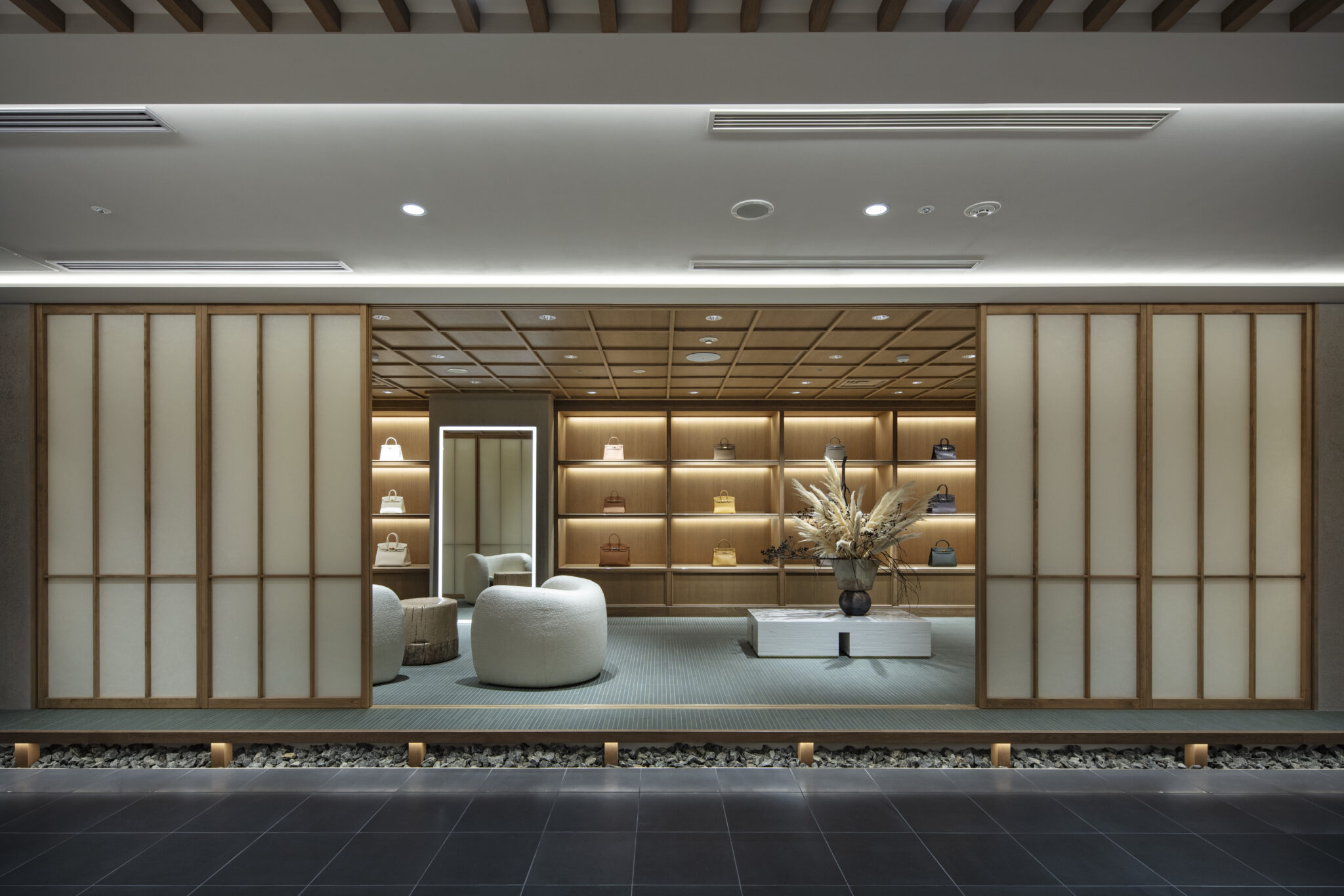
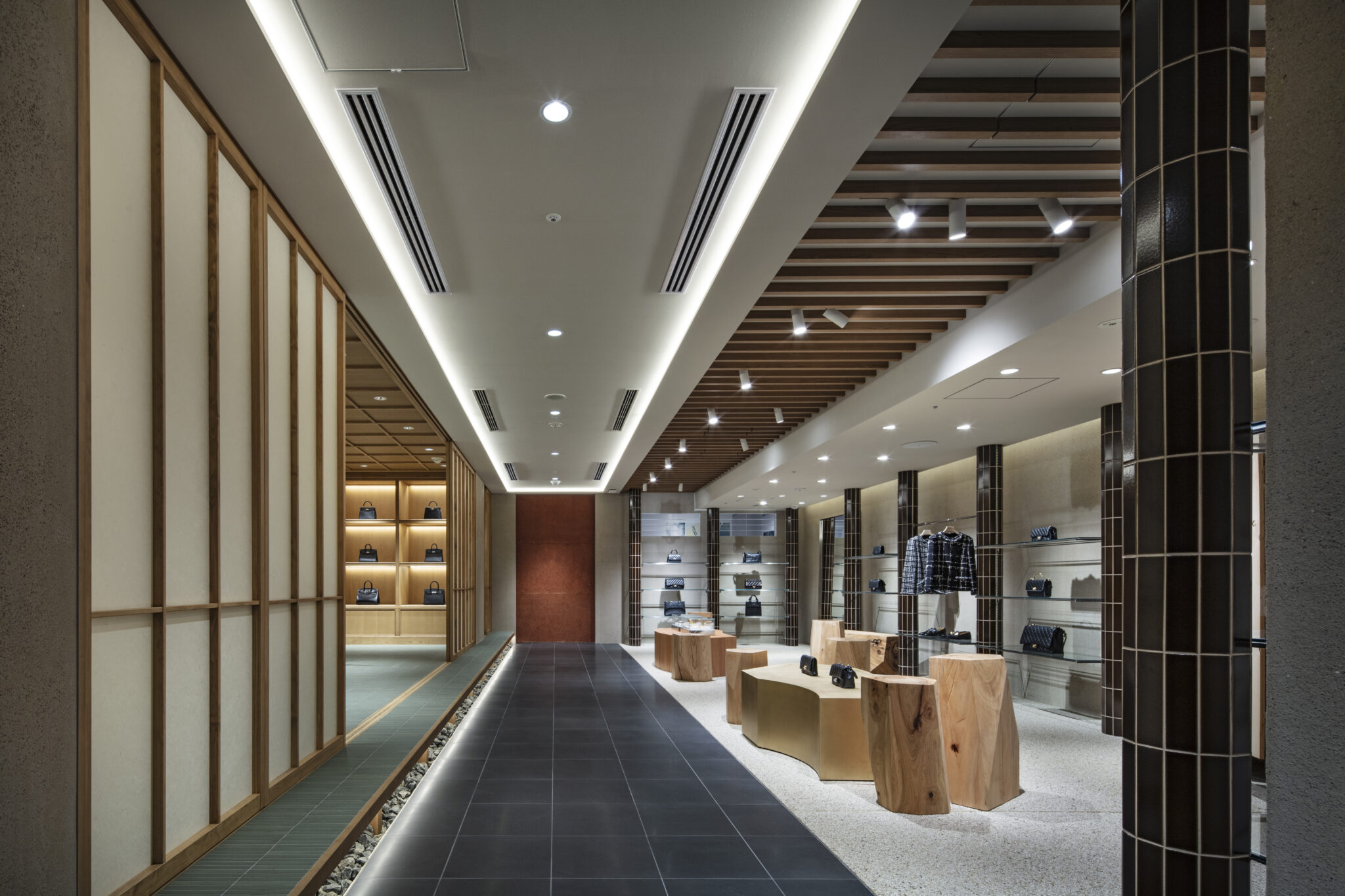
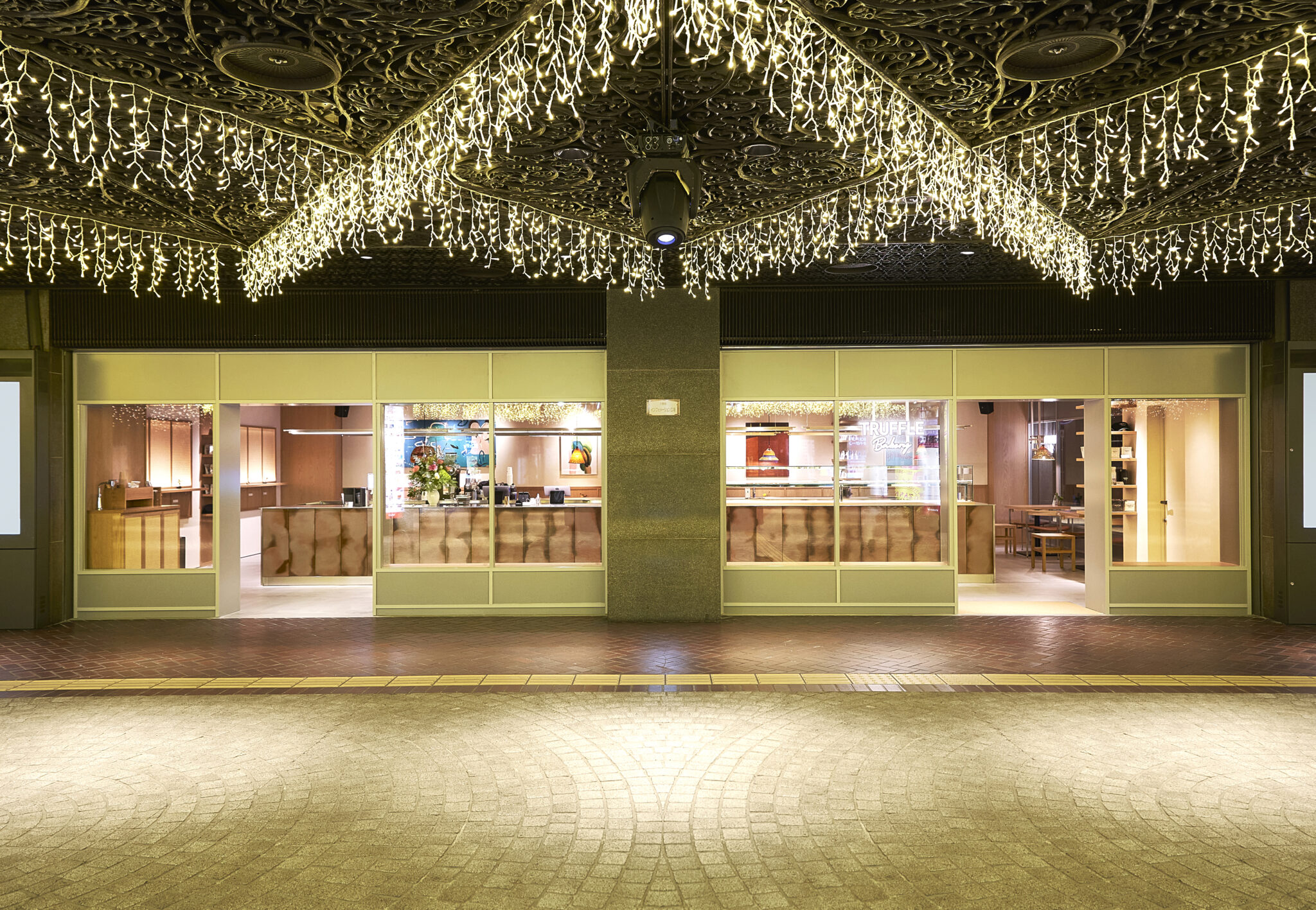
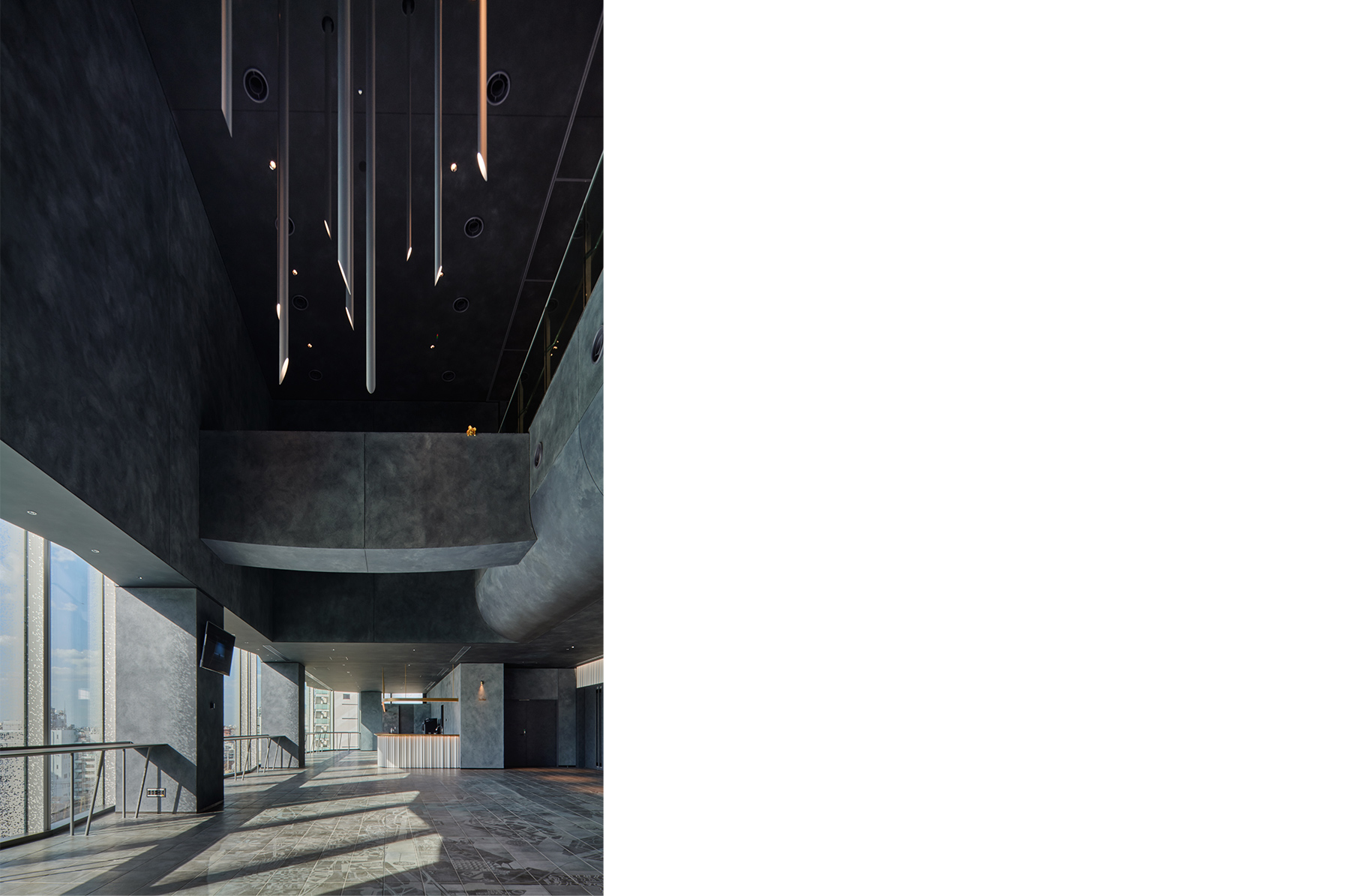
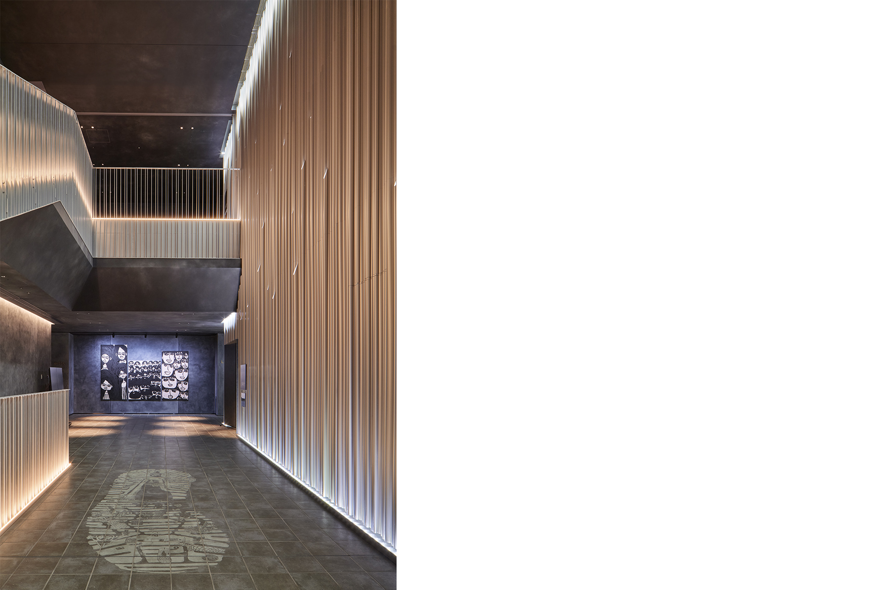
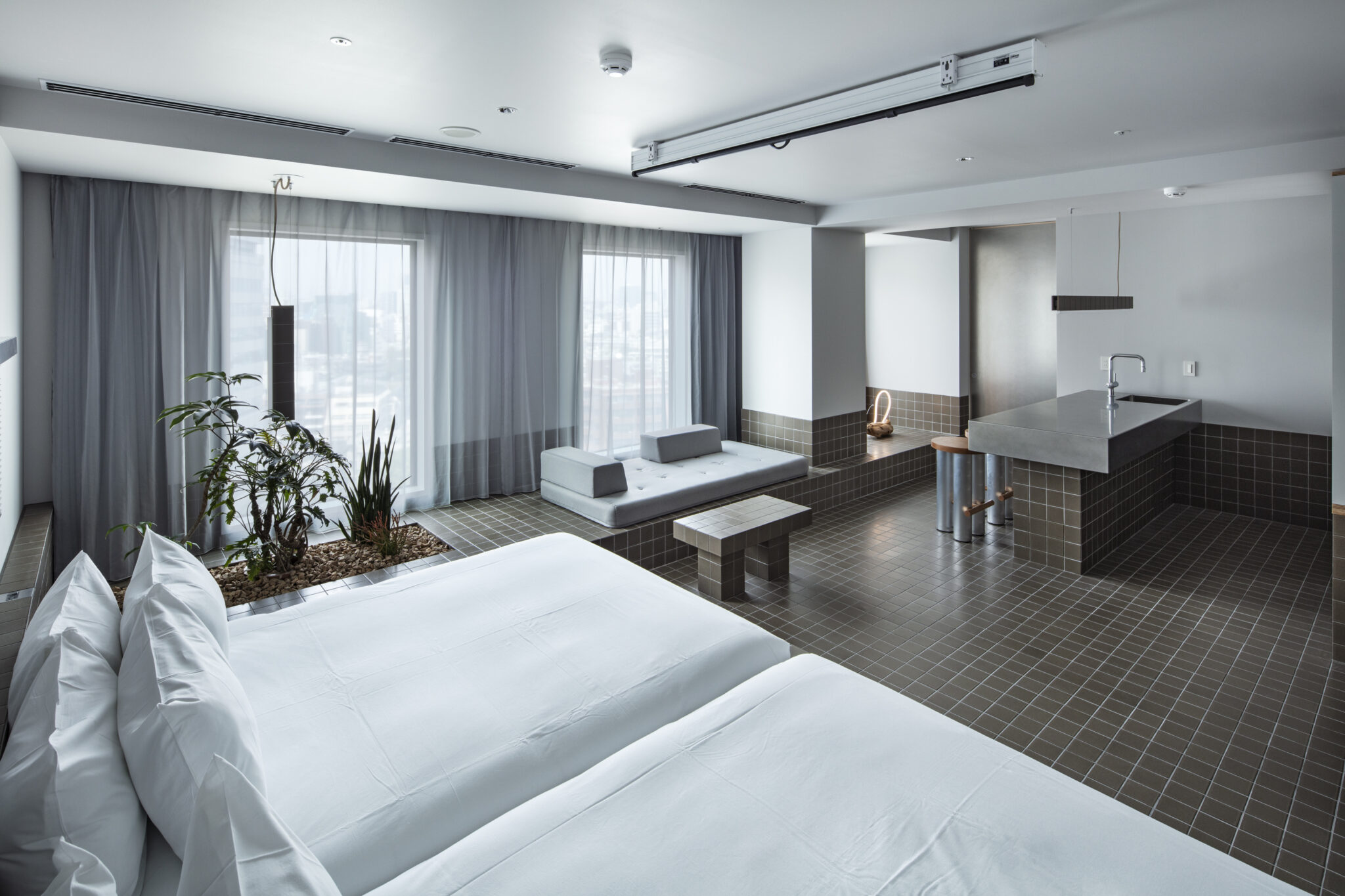
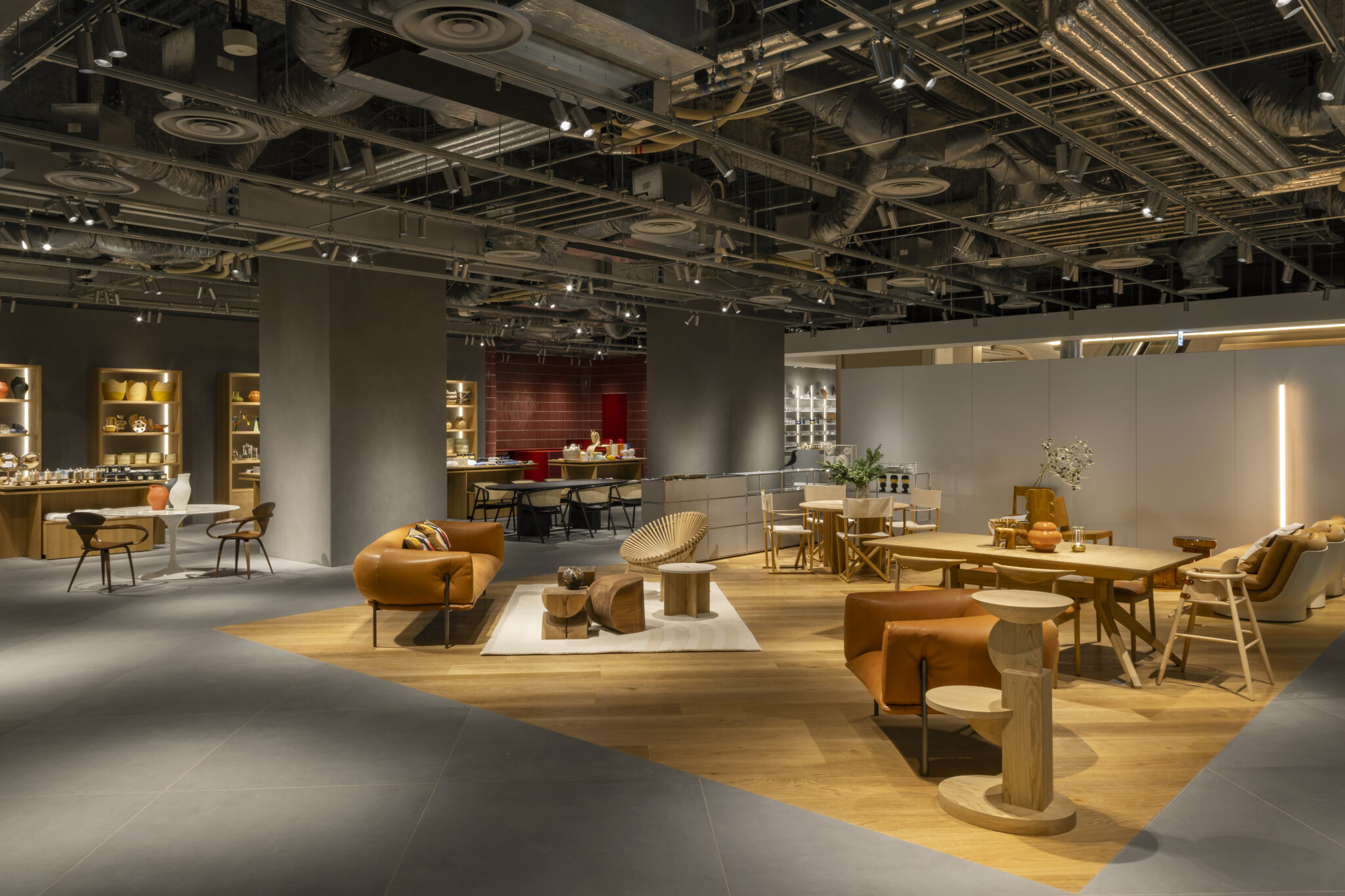
Theater Milano-Za has a capacity of around 900 seats and a layout that can be freely arranged. It is located on the sixth to eighth floor of Tokyu Kabukicho Tower, a building in Kabukicho, Shinjuku, with 48 floors above ground and 5 below. The theatre’s name has been inherited from a theatre that once occupied the site.

2. In which part of the space did you use tiles, and why? Out of the various materials available, why did you decide to use tiles?

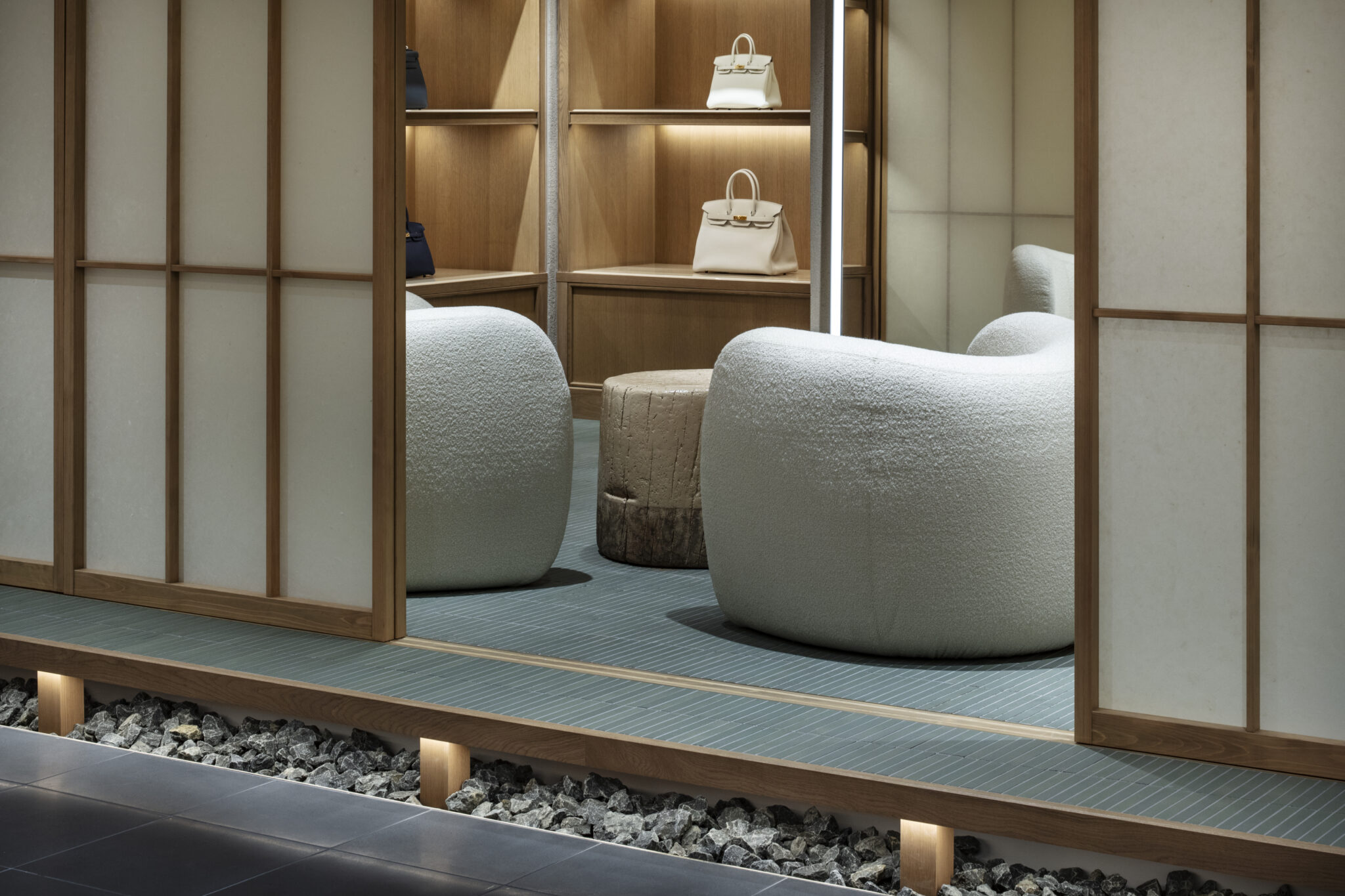
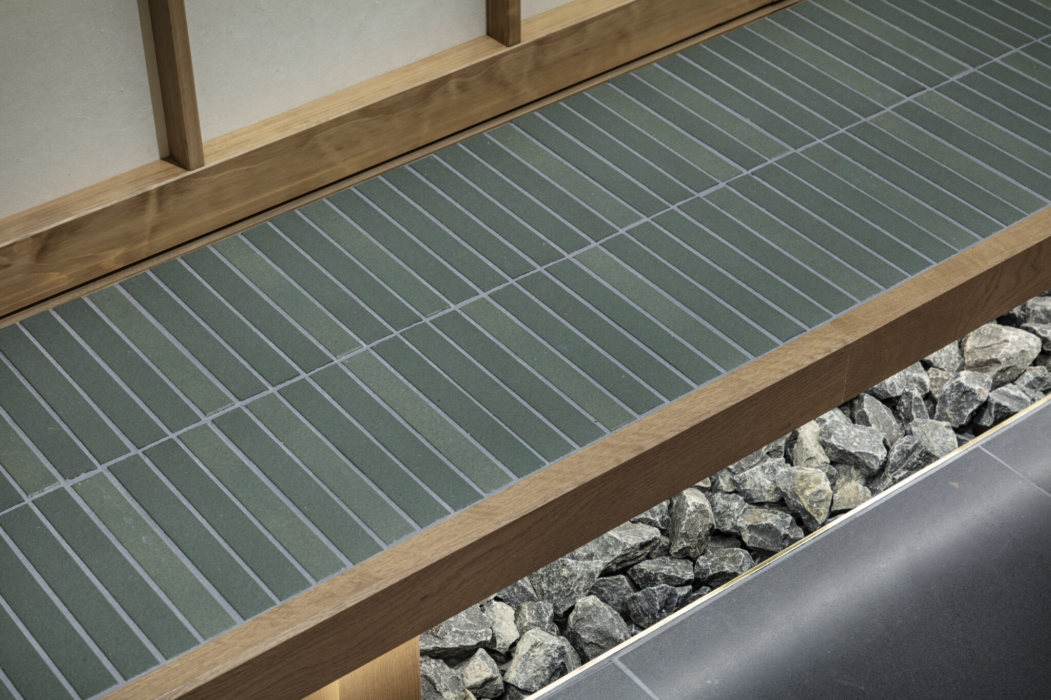
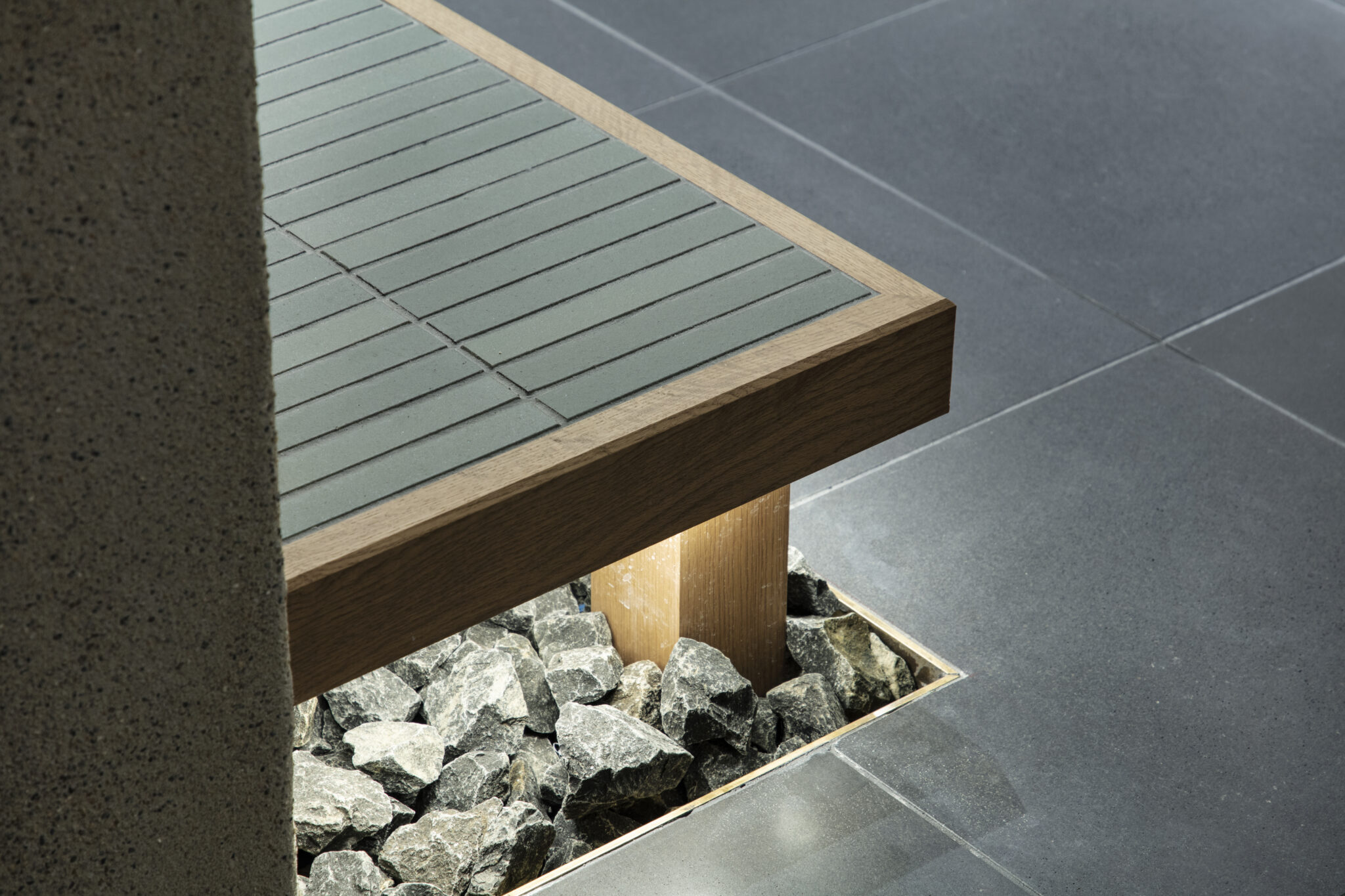
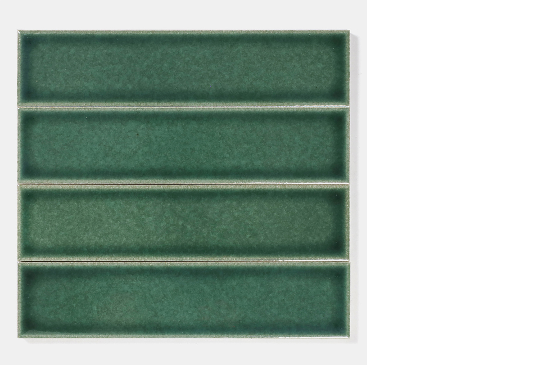
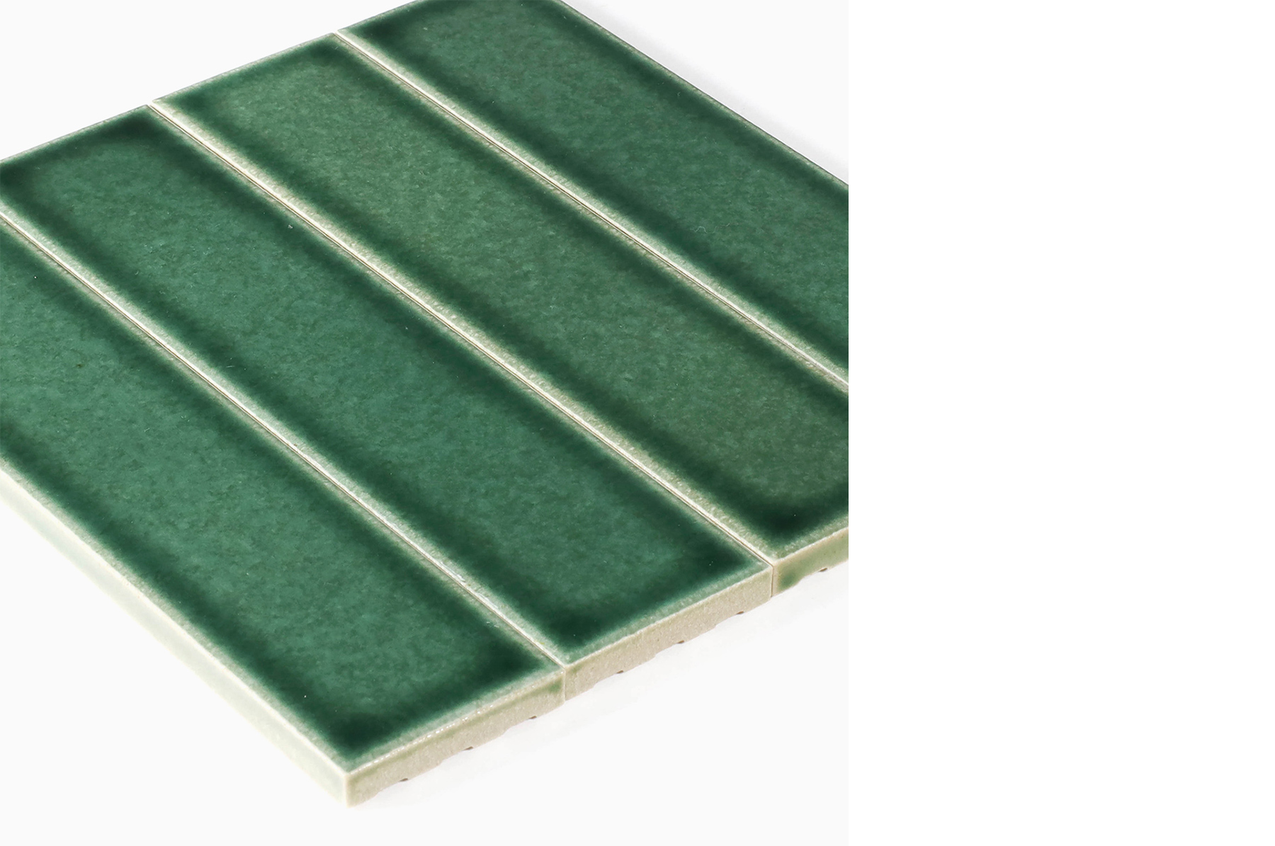
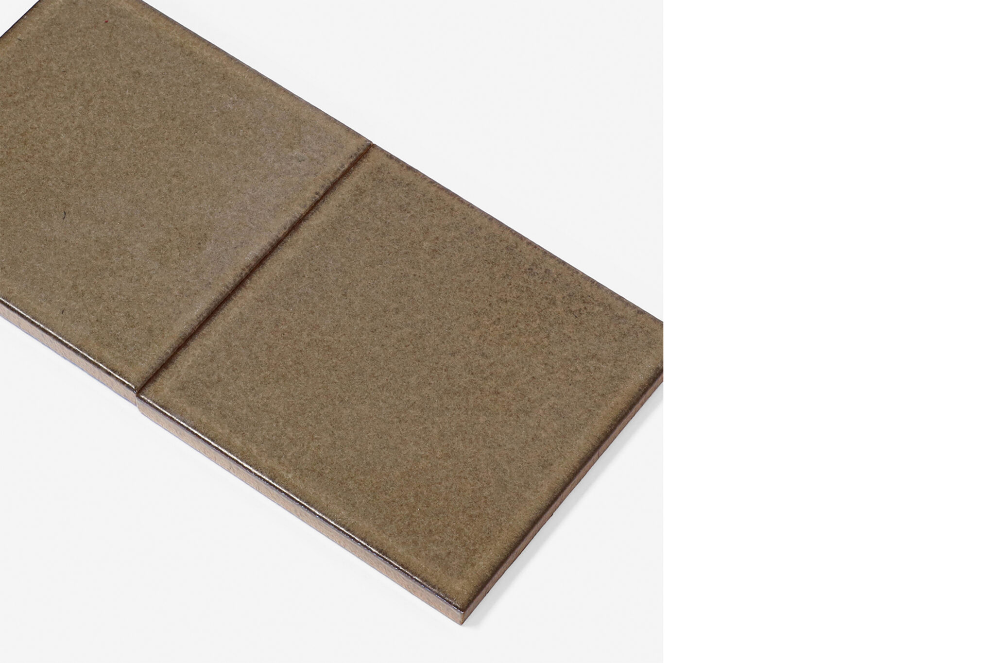
Tiles have been used for the foyer floor. They are a distinctive material with unique character and texture. I use them to give spaces a distinctive feel. Recently, when selecting materials, I have become particularly conscious of choosing those with a physically appealing texture. Virtual spaces have become a common part of everyday life, but textures that appeal to our touch and other senses provide experiences unique to real spaces.

3. When designing the tiles, what were you most particular about?

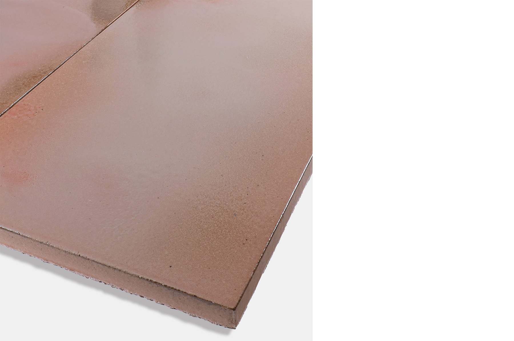
The relationship with light. Shadows and reflections change according to how the light hits the surface, so that was what I was most conscious of. Subtle irregularities on the tile’s surface and in the thickness of the glaze can change the impression significantly, so it was quite hard to decide on the final image.

4. What was it like to produce your own original tiles in Tajimi? Please share your thoughts on the benefits of this process and any other observations you made.

The factory fired a really large number of samples. Even though our order wasn’t so large, the tiles were an important part of the space and so we had our preferences, including some unreasonable requests, but all of our queries were carefully answered.

5. What are your thoughts regarding tiles as materials? Through the production process, did you discover anything new about tiles?

Tiles are a really sustainable material. The basic process of firing clay to make tiles has been passed down since before the Common Era. I often conduct site surveys on old folk houses for renovation projects and while other materials show signs of weathering, tiles continue to exist and carry memories of when they were fixed in place. I can still vividly recall the image of tiles retaining their remarkable colours within a weathered world that has lost its colour.


Yuko Nagayama / YUKO NAGAYAMA ASSOCIATES
Born in 1975. Completed Showa Women’s University in 1998. After working at Jun Aoki & Associates, established Yuko Nagayama & Associates in 2002. Assigned to Visiting Professor at Musashino Art University from 2020. Representative works: “Louis Vuitton Kyoto Daimaru”, “a hill on a house”, “Kayaba Coffee”, “Kiya Ryokan”, “Teshima Yokoo House”, “SEIBU SHIBUYA A・B bld. 5th floor”, “Central Garden – Goddess of The Forest”, “Japan Pavilion, Expo 2020 Dubai” ,“Tamagawa Takashimaya S.C. Grand Patio” , “JINS PARK”.
yukonagayama.co.jp


Q&A with Sakie Takasu

1. For this project you created an artwork in the foyer using floor tiles. What was the request from architect Yuko Nagayama? Was it a prerequisite that you used tiles?

Given that the space was designed by Nagayama-san, has impressive wall lighting and is part of a theatre, I felt that it would function as a place for people to gather. I didn’t originally plan to work with tiles, but by using them in the space from the entrance to the foyer, I was able to create a place where you can touch and step on the artwork, which is usually not possible in museums and other art spaces.

2. What was the theme behind the artwork?

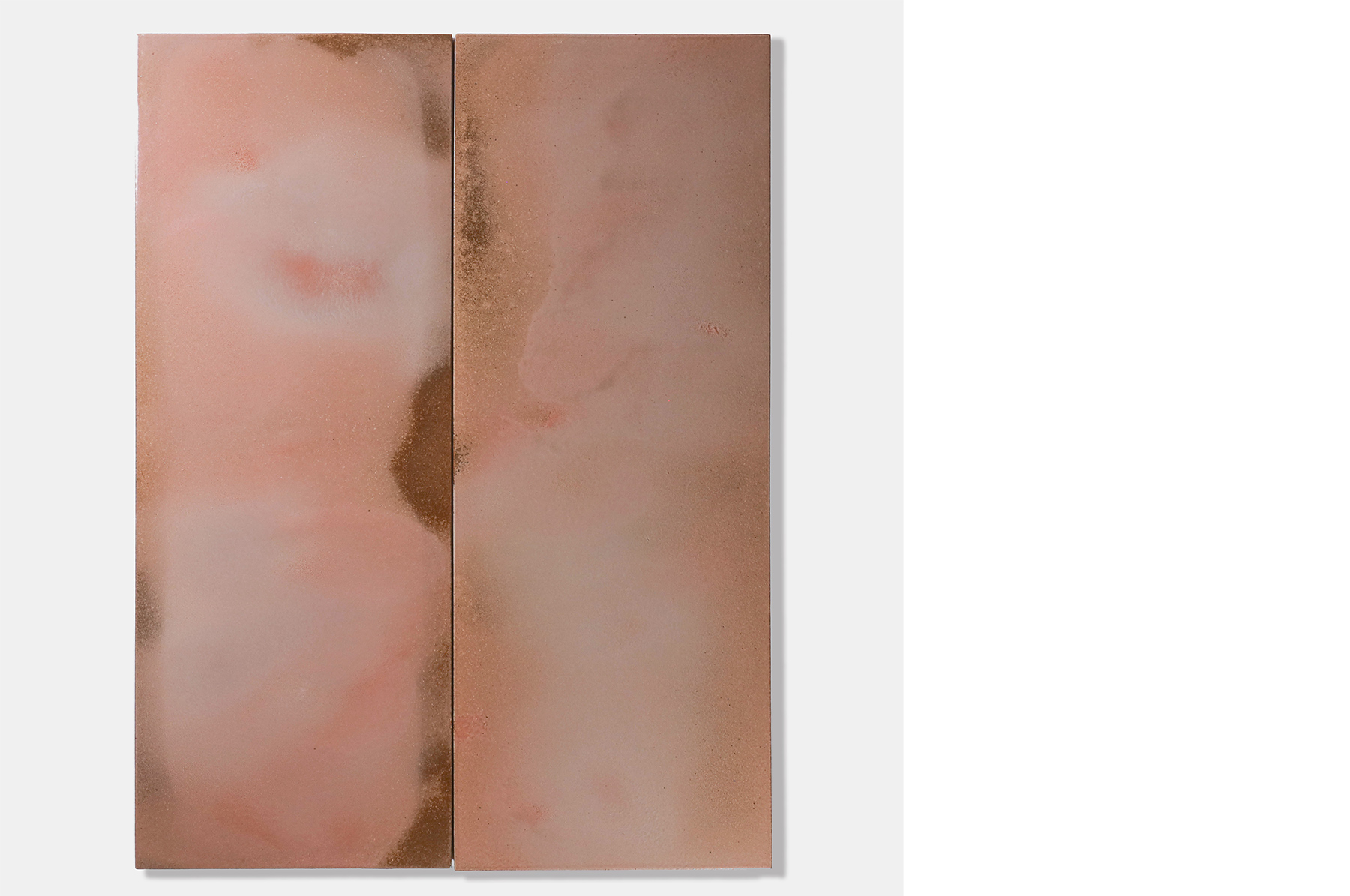
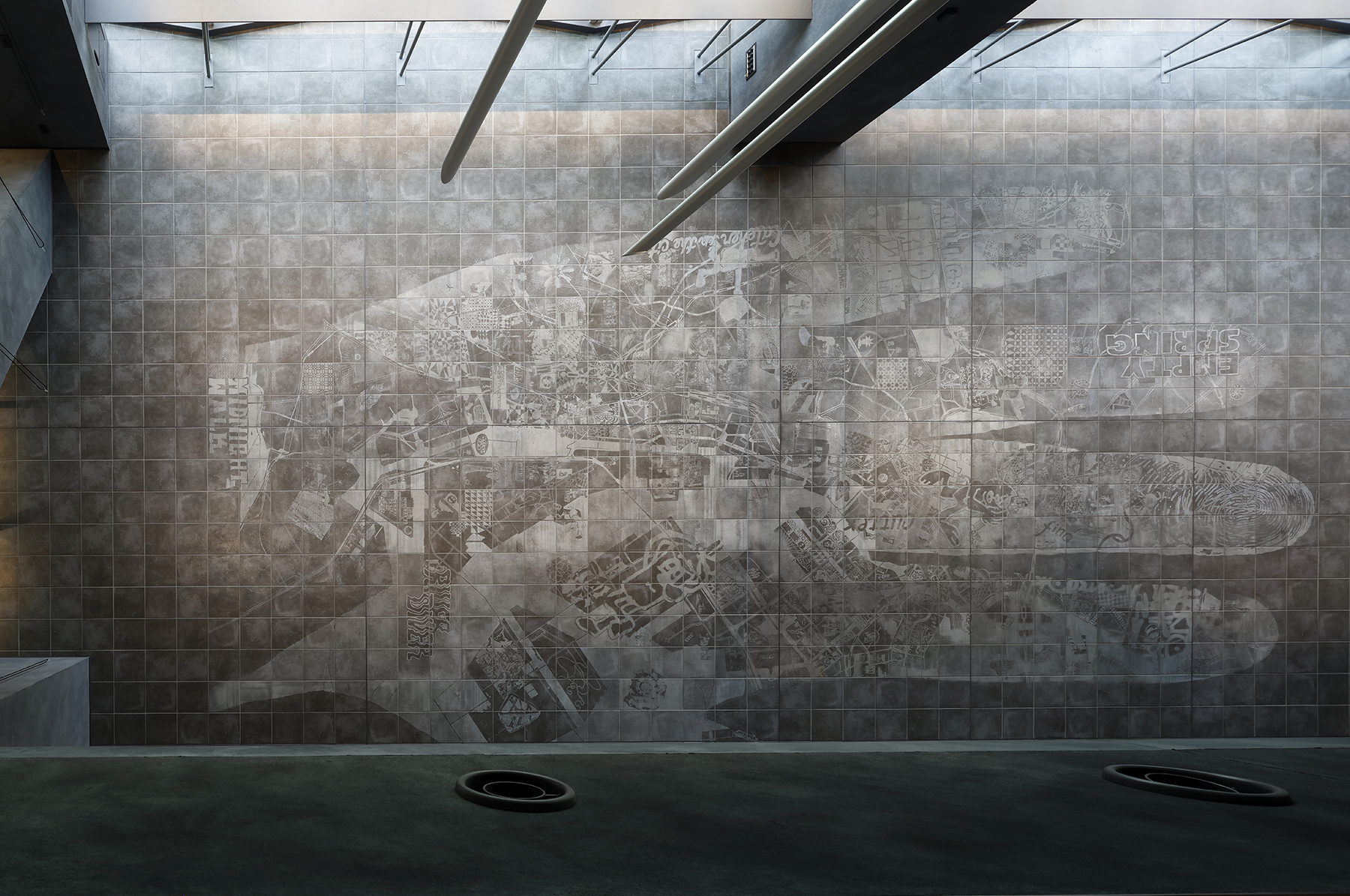
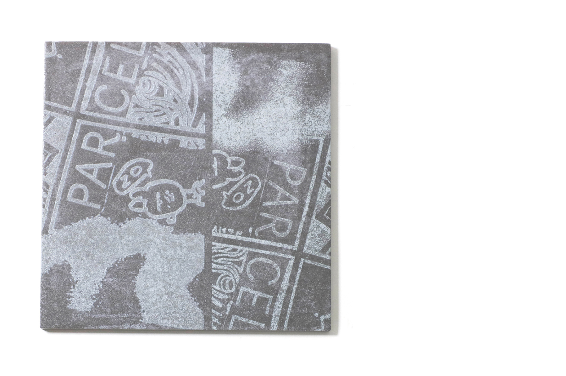
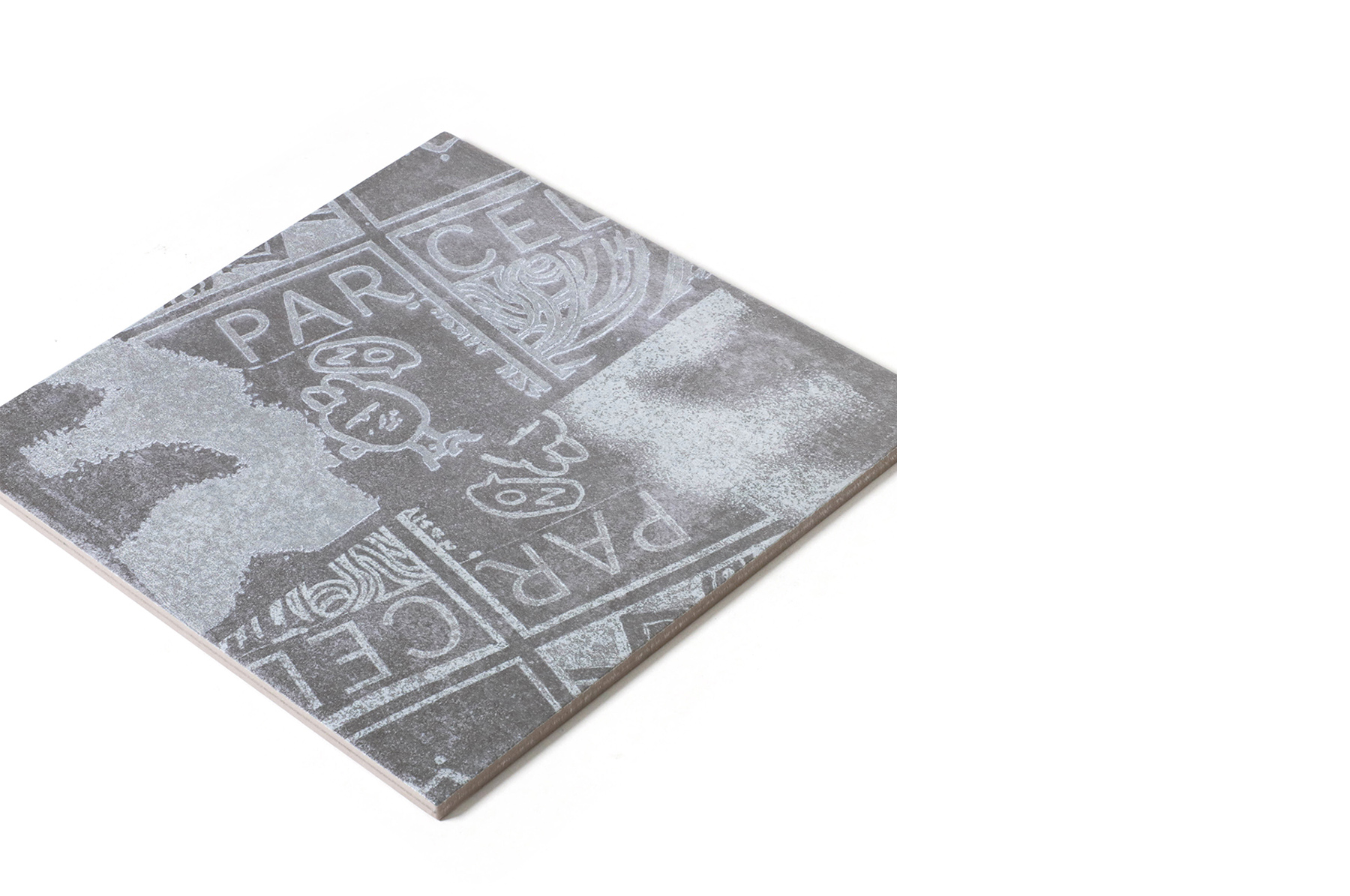
“Patchwork my city” is the title of the work. Gigantic hands, footprints, keys and other images were laser-cut into the floor tiles. Among them, the giant palm in the foyer has collaged images of drawings and maps of Tokyo layered on top of its fingerprints, allowing people to appreciate the work as if walking on top of a huge map. From the second-floor foyer you can see the hand in its entirety, revealing a completely different perspective. The concept came from the fact that theatre originated in plazas and public spaces where a wide range of people come and go, and through the use of tiles, the floor is like a plaza where visitors can walk around and view the work.

3. When creating the artwork, what were you most particular about? Also, what were some of the interesting elements, discoveries or challenges that arose during the process of using tiles?

A total of 683 tiles were used to create the image that is up to 12 metres in length. The appearance of each tile varied according to the laser cutting and application of glaze, so after lining up all 683 tiles, each individual piece was reviewed and fine-tuned by hand and laser. I think that the work brings together the power of humans and machines.

4. Based on your experience, what are the characteristics and strengths of Tajimi as a tile producing region?

When it came to creating a large-scale work using cut tiles, I was able to realize my vision while consulting with the technicians from start to finish. Looking back now, the work itself provided both challenges and revelations, so I feel happy and grateful that they followed it through to the end.

5. What are your thoughts regarding tiles as materials? If you have any personal memories or thoughts about tiles, please share them with us.

Tiles may be associated with cracking, yet they are used for exterior walls and walkways. In terms of production and repairs, they lack the efficiency of asphalt and mortar, and while flat, the tiles themselves are quite heavy and through glazing each one appears slightly different, which is something that I find interesting. When you think about glazes, the infinite colour options make tiles a rare and desirable building material.


Sakie Takasu
Started working under the name Side Core in 2012. Aiming to unravel the rules of public spaces, change mindsets, intervene in interstices and broaden expression and actions, Side Core uses street culture as the basis for working indoors and outdoors with the theme of expanding expression in urban spaces.


edit. Nao Takegata / daily press
translate. Ben Davis

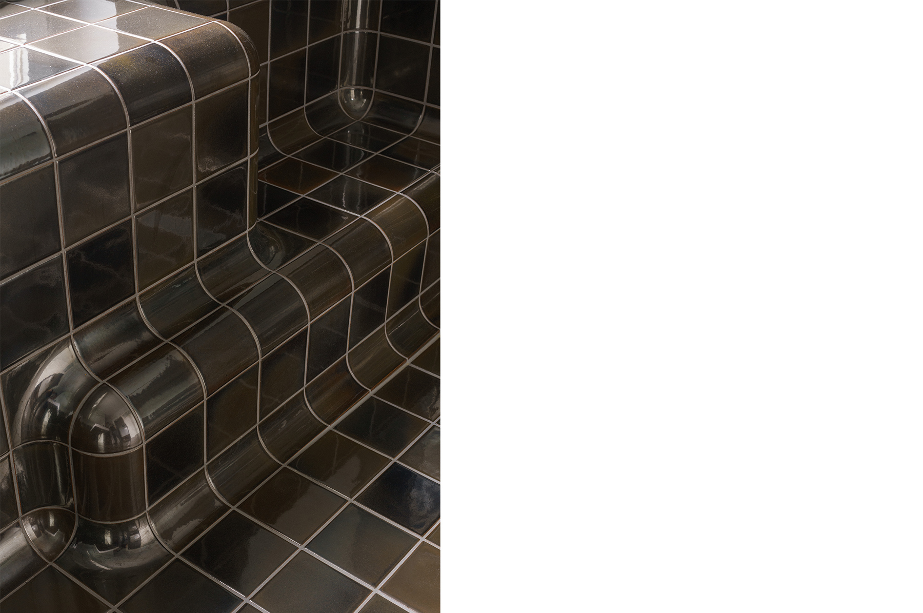
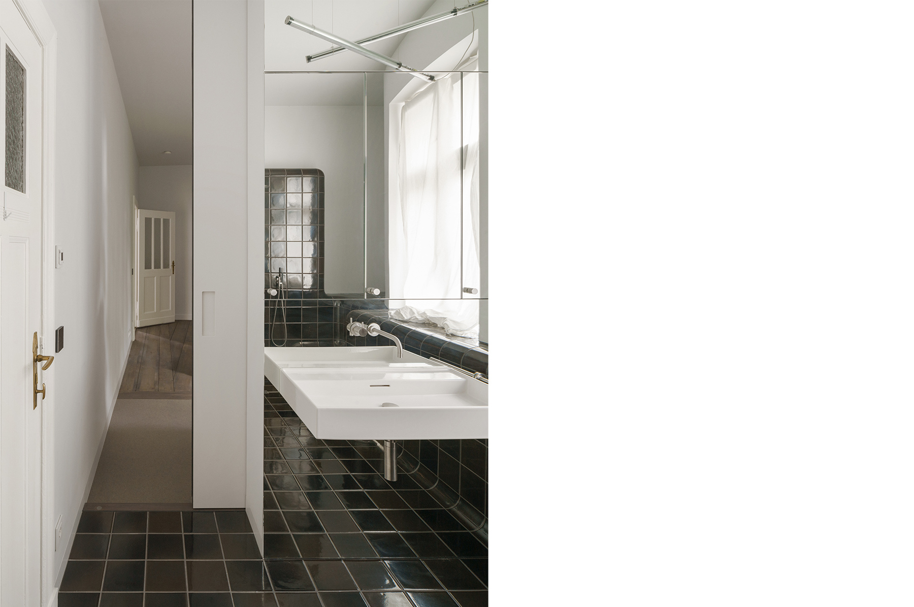
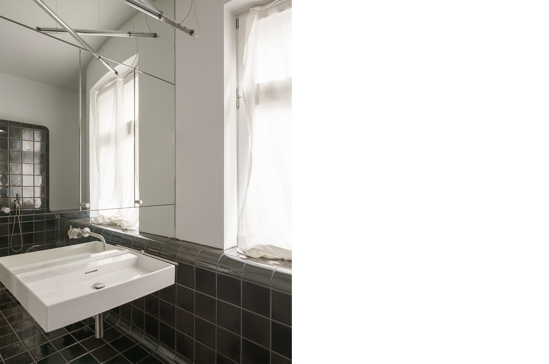
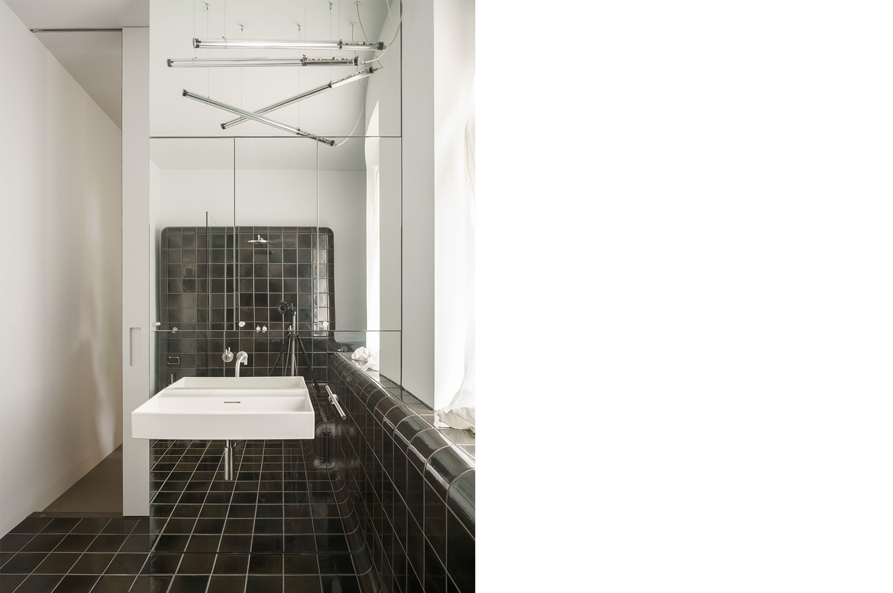
APARTMENT HB

year

2024

location

Berlin, Germany

architect

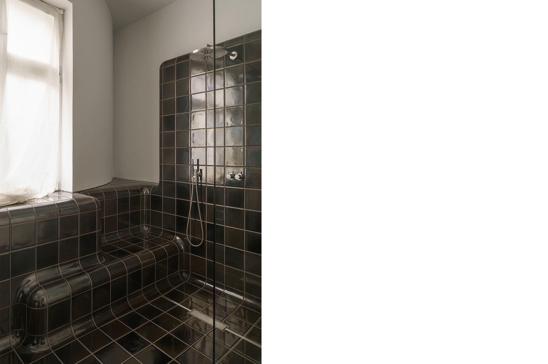
Pasztori Simons Architekten (Tile : Max Lamb)

method

Pressure Moulding

volume

Quantity 18m2

photographer

photo: Sebastian Schels

hince Takashimaya Gate Tower Mall store

year

2024

location

Aichi, Japan

architect

Yookyung Jung

method

Dry Press

volume

Quantity 31m2

photographer

photo: Masato Suzuki

Q&A with Yoonkyung Jung

1. Please describe the shop and the concept behind the spatial design.

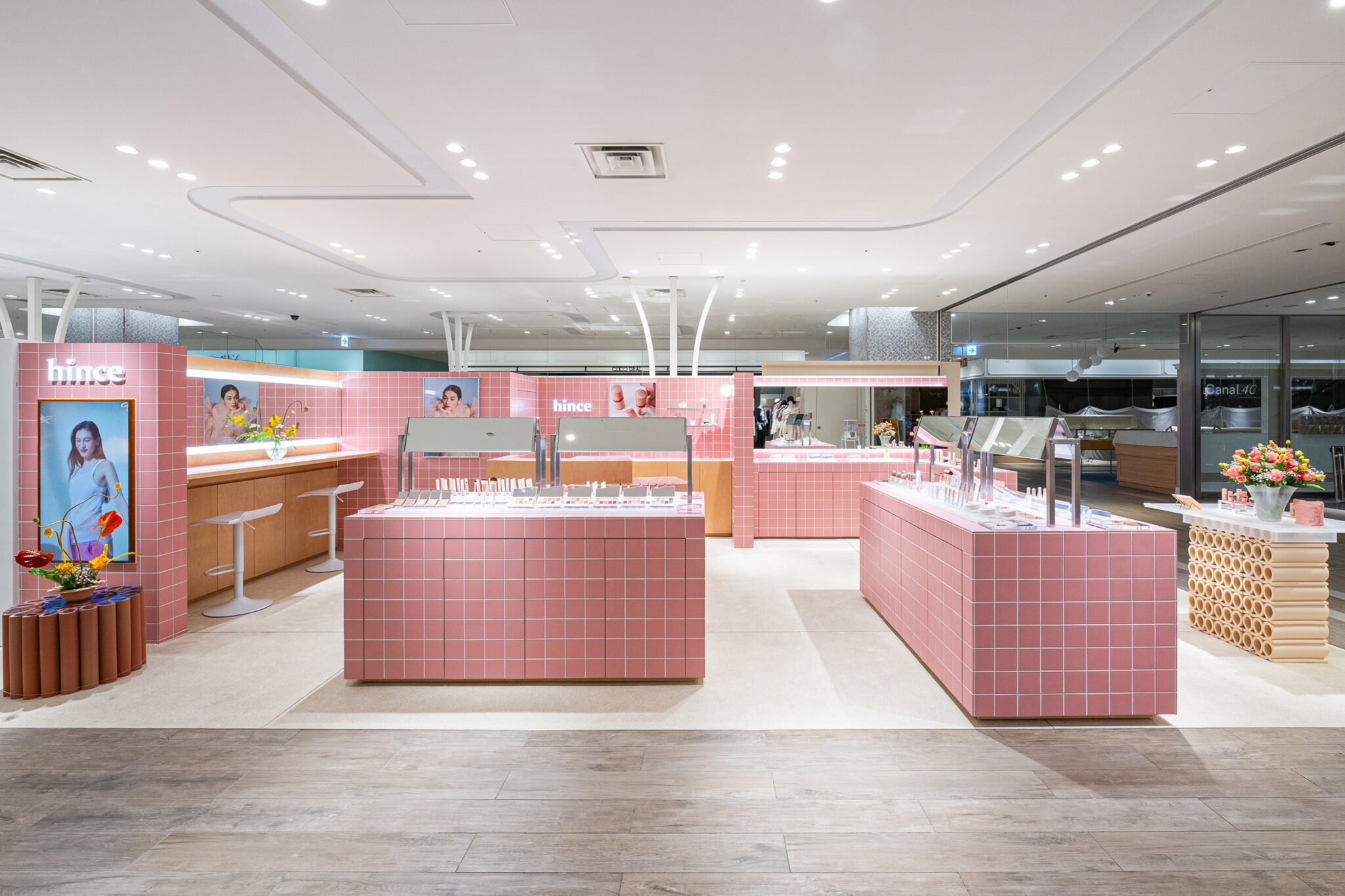
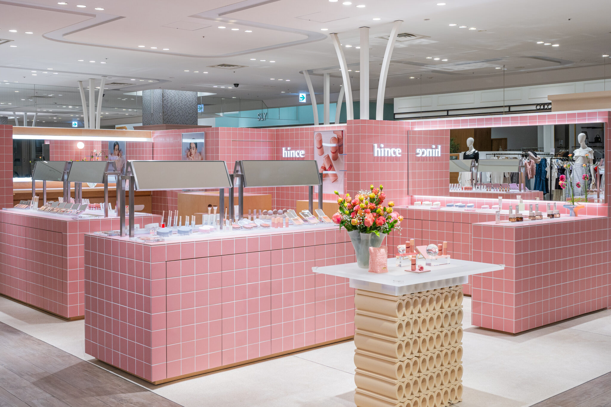
“hince” is a “Mood-Narrative” makeup brand that expresses your full potential by building on natural beauty unique to you with its dense and rich colors. “hince” inspires you to have confidence in your beliefs and aspirations for a more passionate life. As per “hince” respects each individual’s own beauty, ceramic tile was interesting material to convey the brand identity to the “hince” TGM store in Nagoya. Though each tile looks all the same and has same sizes, while firing in the kiln with the glaze on, it cannot be exactly the exact same and has own identity in it. As we enhance the beauty of individuals and conduct mood narrative into the store identity, “hince” always tries to apply the local regional characteristic on the store design. We found that TCT was located near Nagoya and the materialistic of ceramic tile was interesting to contain the story of the “hince”.

2. In which part of the space did you use tiles, and why? Out of the various materials available, why did you decide to use tiles?

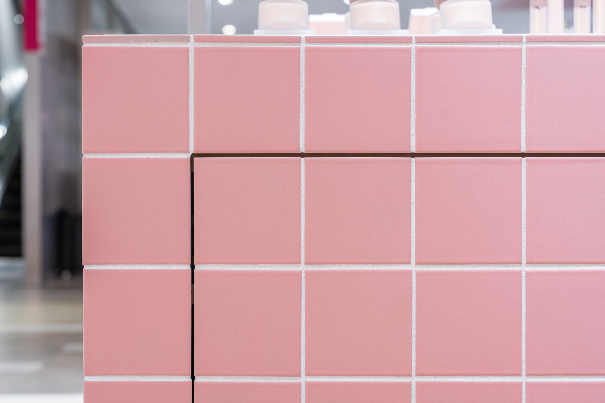
The most part of “hince” Takashimaya gate tower mall store was covered with tiles. The reason why we used tile was mostly because it could convey the brand story indirectly by using tiles. We found that materiality of ceramic was very interesting. Because at first glance, the tiles have the same color and shape, but since they are fired in a high-temperature kiln, the size and color of the glaze are slightly different, and each tile has its own uniqueness.

3. When designing the tiles, what were you most particular about?

We didn’t design the tiles directly, but it was very intriguing to use and apply the Kwangho Lee X TCT collaboration tiles into this store. We could have delivered the brand identity to customers in depth.

4. What are your thoughts regarding tiles as materials? Through the production process, did you discover anything new about tiles?

While working with TCT I found that tiles could have different textures by having different glazes once more. Also, by having variety of shapes we could create diverse designs not only limited as interior or exterior finish but could expend the usage more as a medium of art works. 

5. What was it like to produce your own original tiles in Tajimi? Please share your thoughts on the benefits of this process and any other observations you made.

It was professionally handled and precisely produced among the better understands of designer’s intention very well. So, TCT offers spacious room to depict what designers envisioned exactly.


Yoonkyung Jung / hince Interior Design & VMD Manager
Graduated Design Academy Eindhoven in the Netherlands. She returned to Korea and is primarily focused on working in spatial branding. Currently she is working as an interior designer and VMD in “hince”. 


edit. Nao Takegata / daily press

LULLA

year

2024

location

Kanagawa, Japan

architect

I IN Inc.

method

Extrusion

volume

Quantity 65m2

photographer

photo: Tomooki Kengaku

Q&A with I IN

1. Please describe the shop and the concept behind the spatial design.

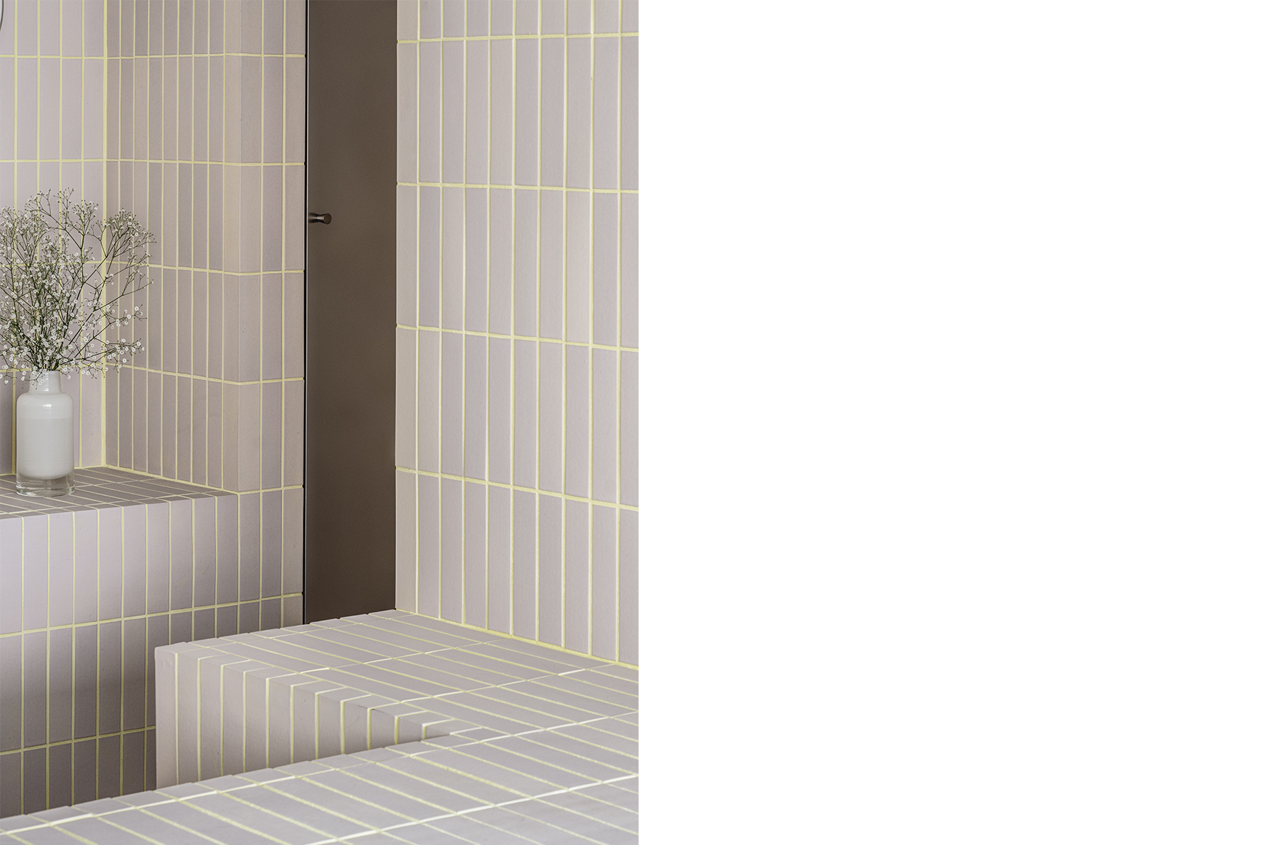
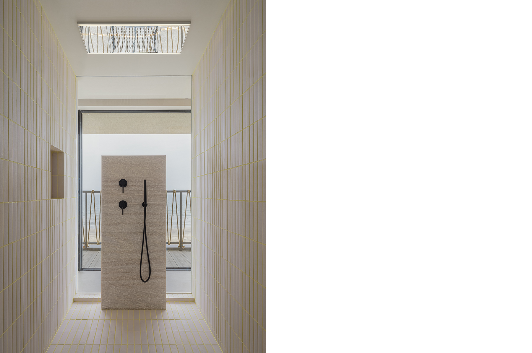
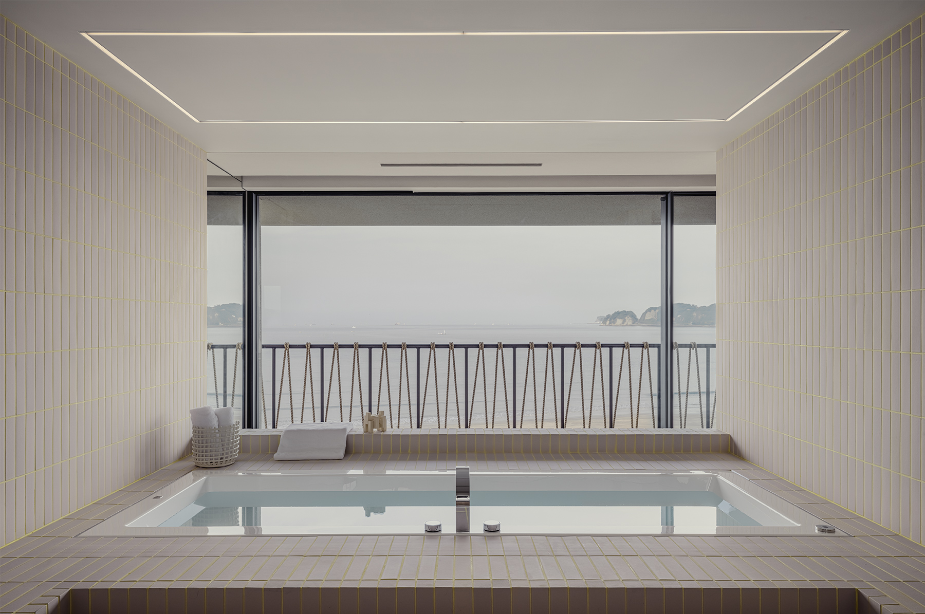
Lulla is the three-story residence of the owner of lifestyle brand Sea Room Lynn. It is situated in an impressive location overlooking Zaimokuza in Kamakura, providing a feel for the connection between ocean, beach and sky. I wanted to create a design that conveyed the dignified taste of the brand and its owner. From the layout to the materials, furniture and details, the space was created to include elegant, unique, majestic, soft and new elements.

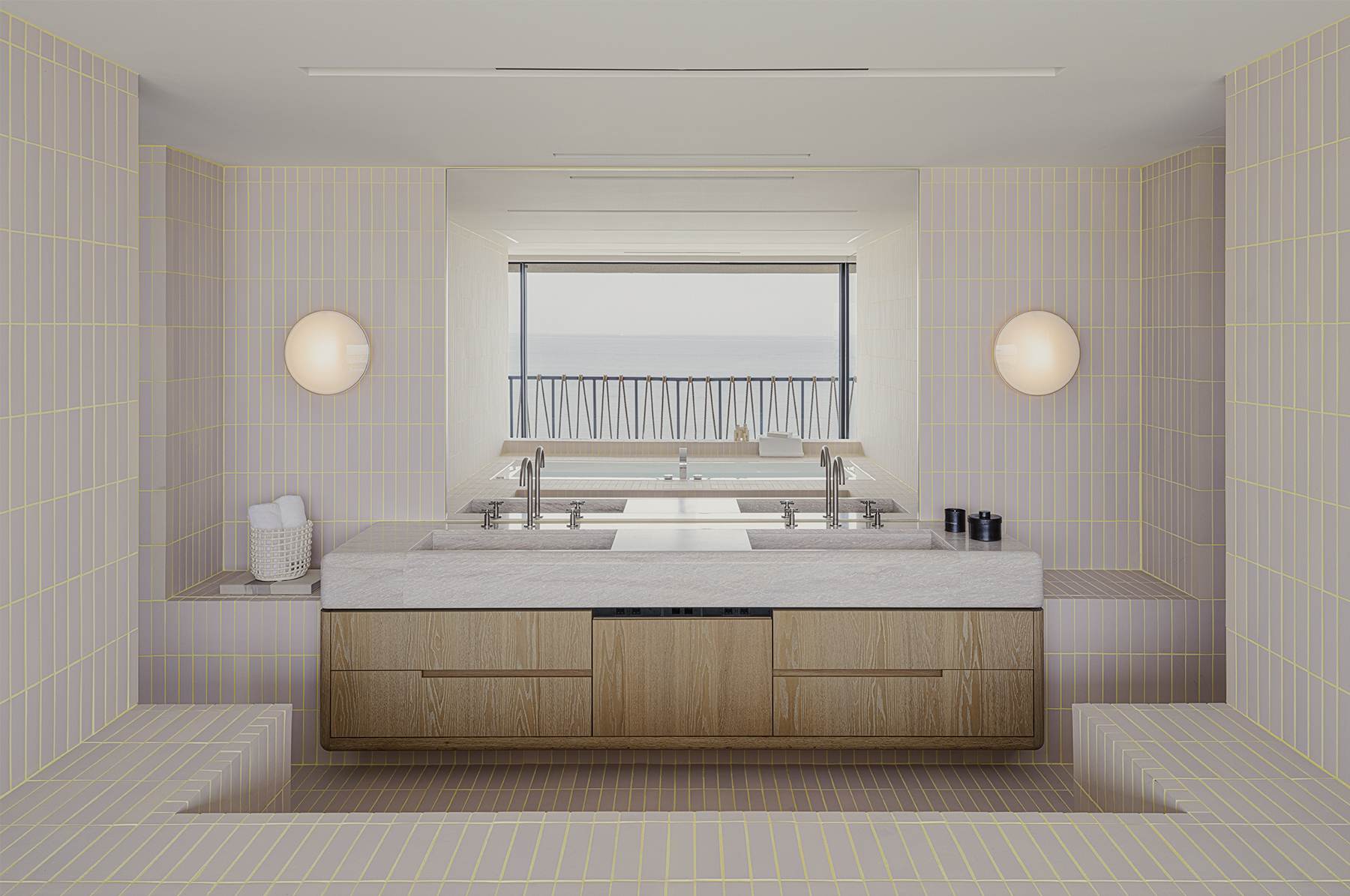
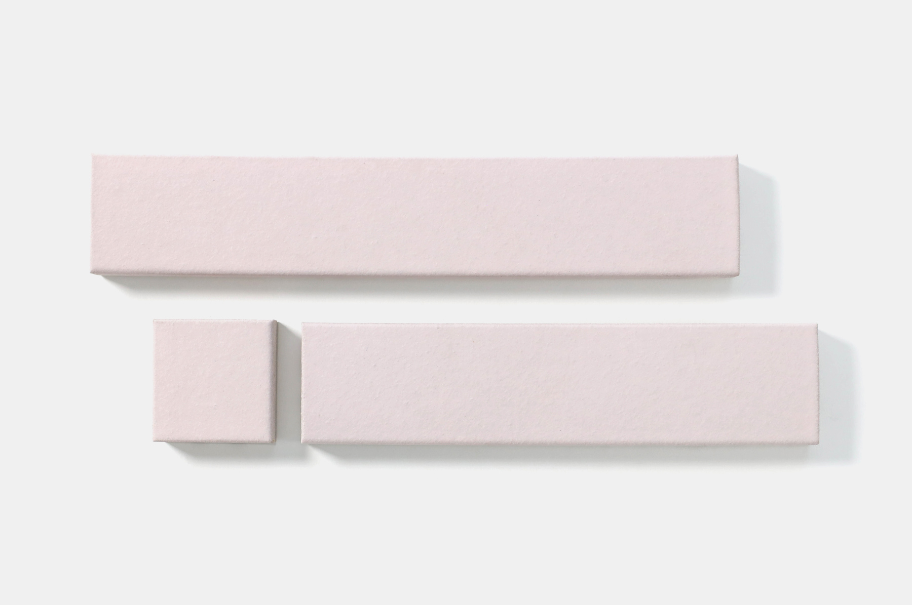
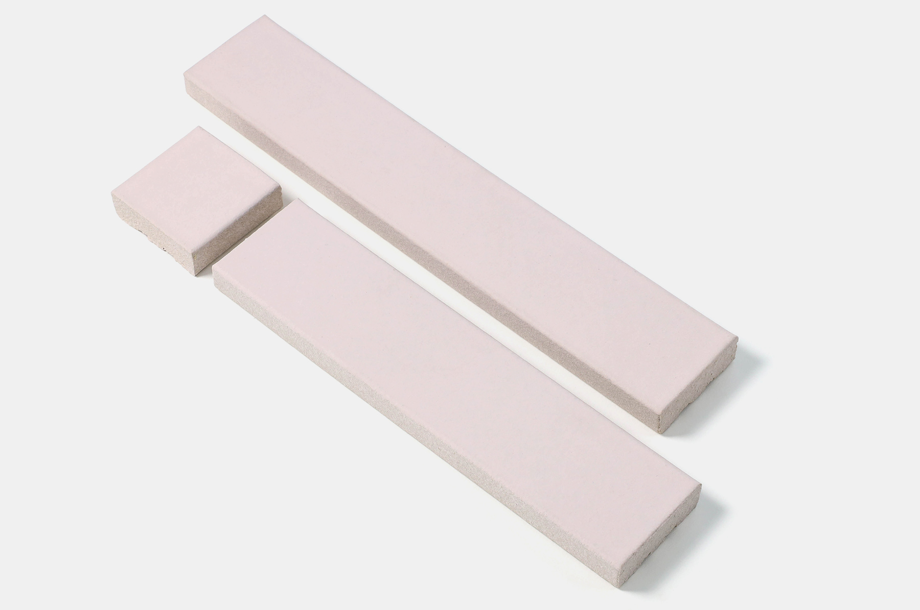
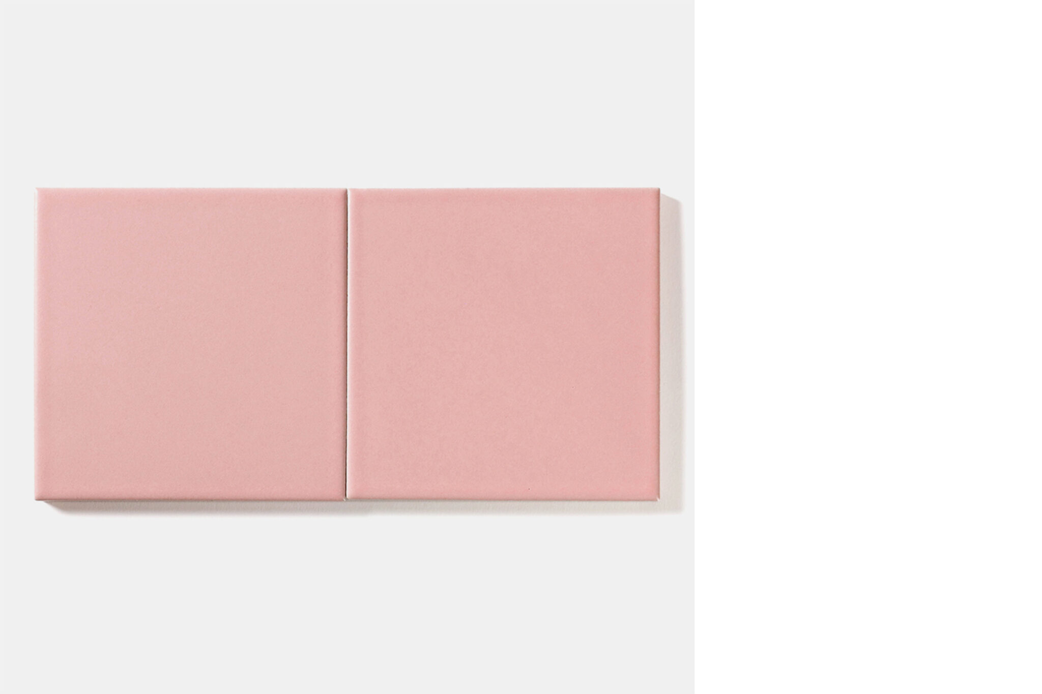
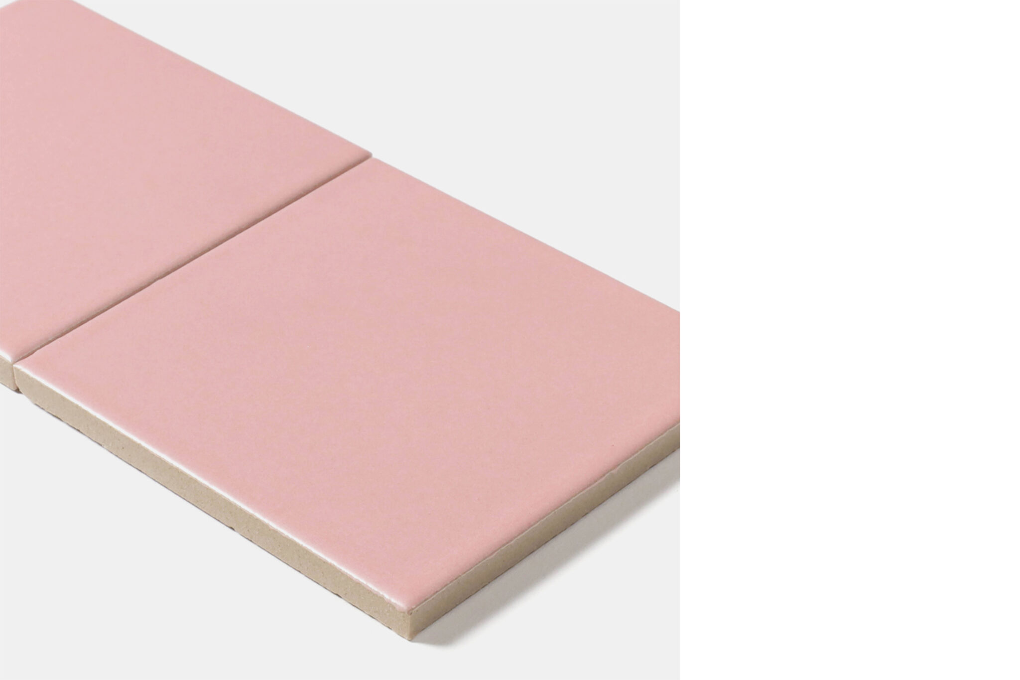
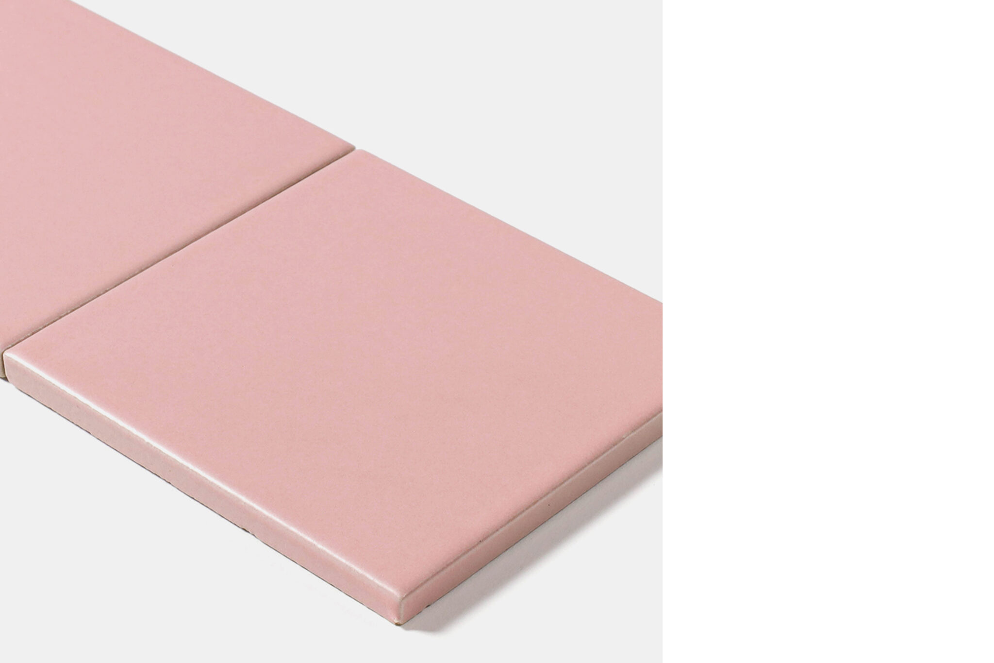
Original tiles were installed in the open bathroom that occupies around half of the third floor and feels connected to the ocean. The wet areas, including the shower room, vanity counter and bathtub, are seamlessly connected. In the same way that fashion is about enjoying designing with fabric and thread, the original tiles were made in pink and finished with yellow grout.

2. In which part of the space did you use tiles, and why? Out of the various materials available, why did you decide to use tiles?

The large bathroom windows showcase the ocean and sky, allowing sunlight to fill the space. I wanted to use materials with a sense of nature to match the natural light and scenery.  I also wanted to express the cleanliness of the bathroom in a balanced manner and placed importance on the materials having a gentle touch. The tiles made by Tajimi Custom Tiles have a softness that allows you to imagine the soil being worked by hand. In the open space, uniform yet uneven tiles with gentle expressions link the washbasin, shower and bathtub as one.

3. When designing the tiles, what were you most particular about?

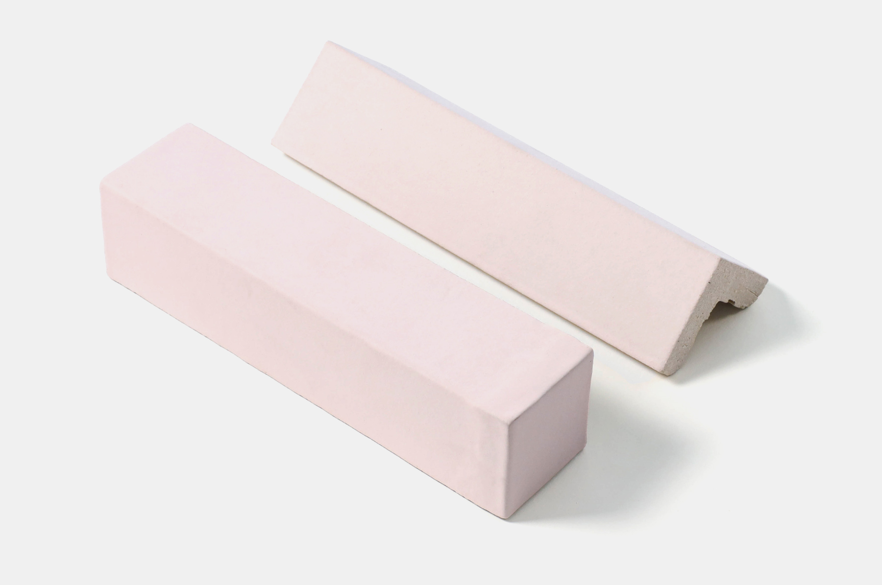
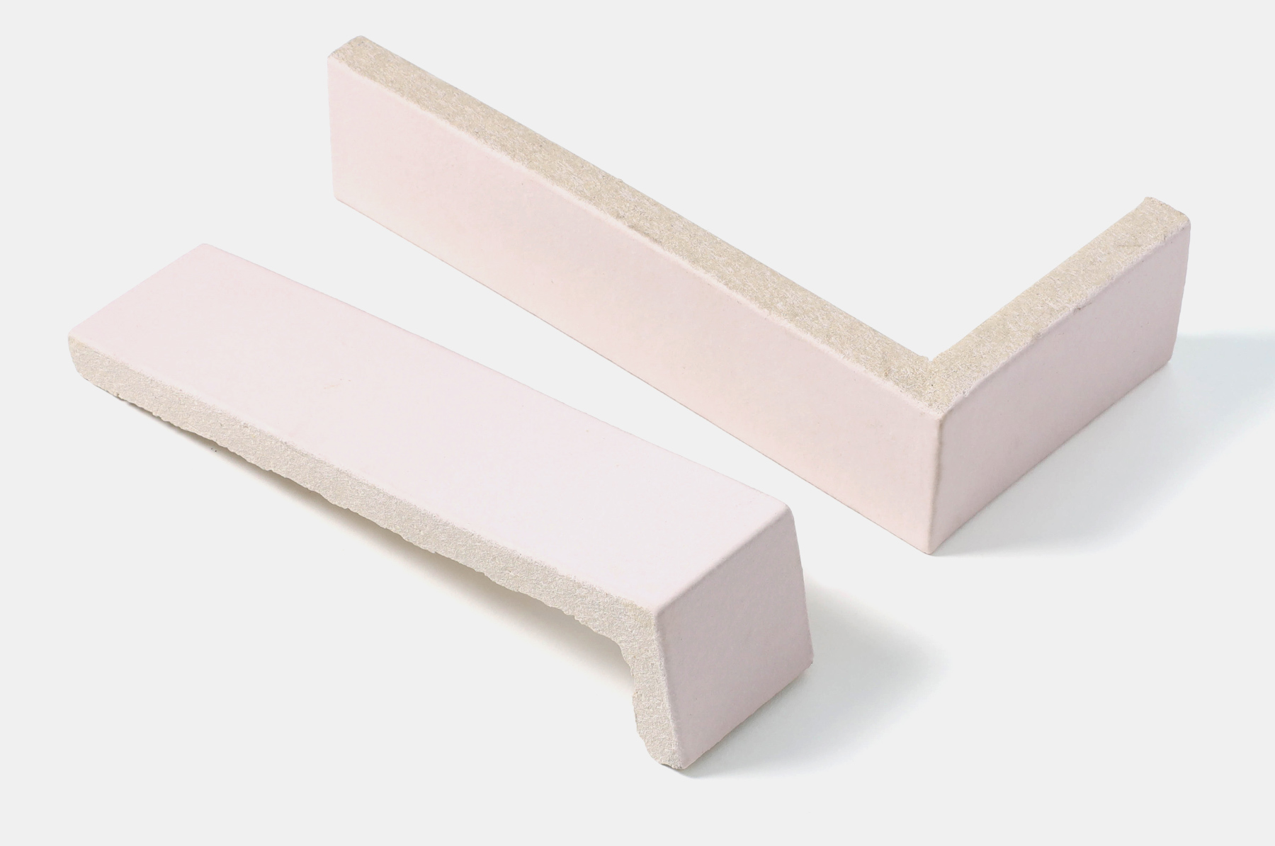
The plan was to use tiles for the entire bathroom and in order to make the complex and diverse forms of the floor, steps, walls and benches pleasing to the eye, a wide variety of special trims were made.  Each and every tile had a slightly different colour, giving a gentle and unified feel to the space.

4. What are your thoughts regarding tiles as materials? Through the production process, did you discover anything new about tiles?

I had the impression that tiles were a homogenous material to be adhered to something else. However, each tile has its own character and I was particularly fascinated by how this is shaped by human hands as well as gravity, heat transmission and other earthly forces. It’s the first time I’ve had trim pieces made and I’m excited about their possibilities.

5. What was it like to produce your own original tiles in Tajimi? Please share your thoughts on the benefits of this process and any other observations you made.

Up until now, I had a strong impression that tiles were industrial products — mass-produced and mass-consumed. For this project, TCT carefully customised the tile colours. From the first prototype onwards, I felt that they really understood our design intent. They also clearly explained in advance what would and would not be possible and seemed to have a lot of experience dealing with irregular requests.


I IN Inc.
Founded in 2018, I IN Inc. is an internationally acclaimed Tokyo-based design firm. I IN pursues the world of Modern Luxury within a wide range of spatial design fields, including retail, restaurants, offices, residences, and installations. The design process begins by delving into the mindset of clients and understanding their core values to identify intrinsic elements of their individuality. Every communication and dialogue with clients and collaborators contribute to interiors that bring new brilliance and experiential values to light, color, materials, and gravity. In reawakening the senses to these universal and intangible elements of design, I IN Inc. creates inspired spaces that evoke a new vision of richness for the world of the future – one grounded in the sublime beauty of its interiors.
i-in.jp


edit. Nao Takegata / daily press
translate. Ben Davis

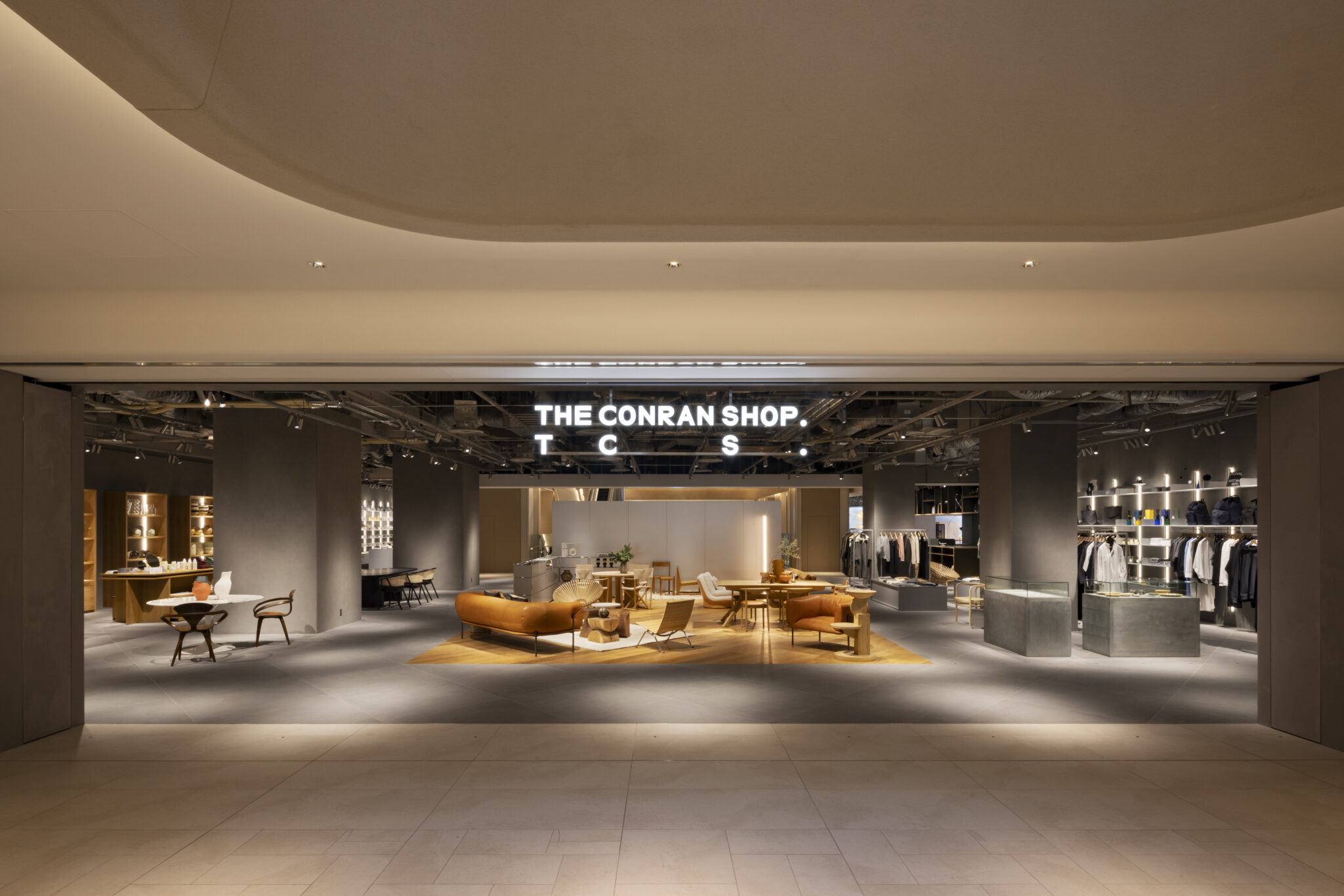
The Conran Shop Tokyo

year

2023

location

Tokyo, Japan

architect

The Conran Shop

method

Extrusion

volume

Quantity 57m2

photographer

photo: Yuna Yagi

Q&A with The Conran Shop

1. Please describe the shop and the concept behind the spatial design.

The Conran Shop, a home furnishing shop founded in England, opened The Conran Shop Tokyo at the Azabudai Hills complex in November 2023. The Conran Shop’s seventh and largest location in Japan covers around 1300 square metres and is the first to include a restaurant. The company will celebrate 30 years in Japan in 2024 and having renewed the global brand logo last year, it has also been developing a unique character for each shop, among other initiatives. The spatial design and details of The Conran Shop Tokyo, which has a theme of “the finest daily life”, were based on keywords such as fluid space, robust, bold, energetic, light, clean and balanced.

2. In which part of the space did you use tiles, and why? Out of the various materials available, why did you decide to use tiles?

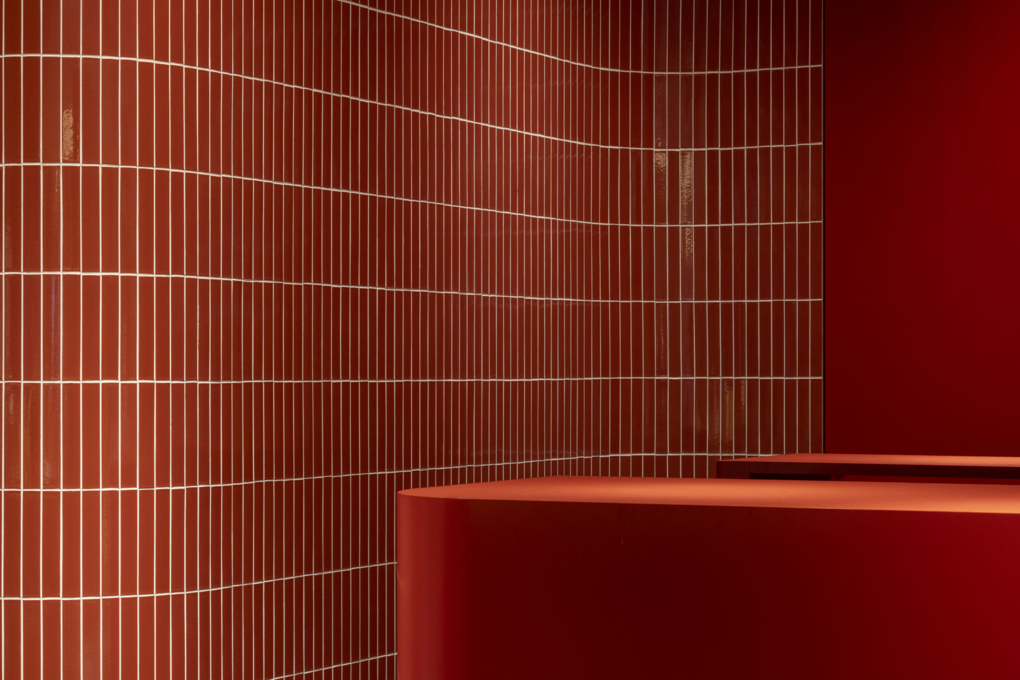
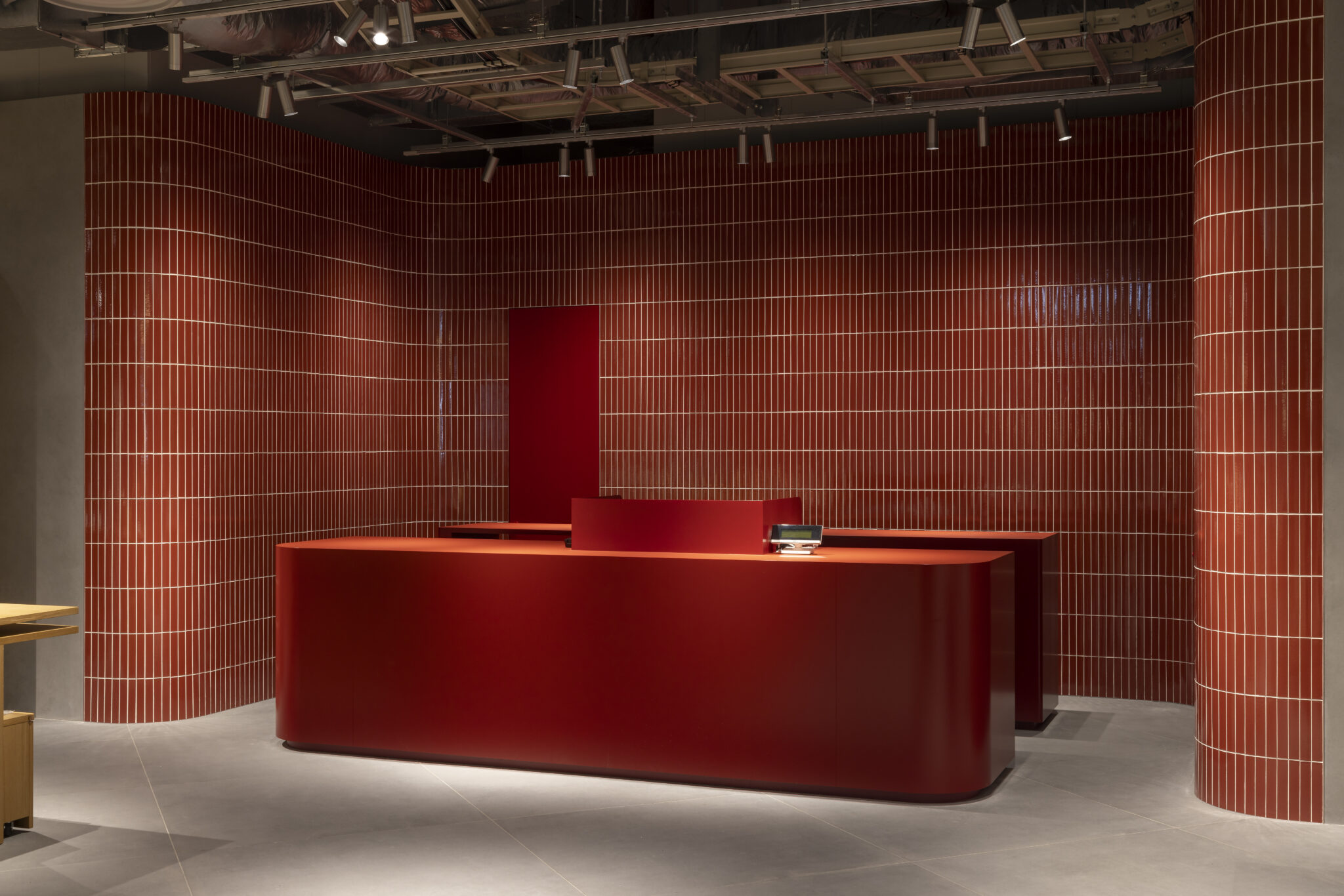
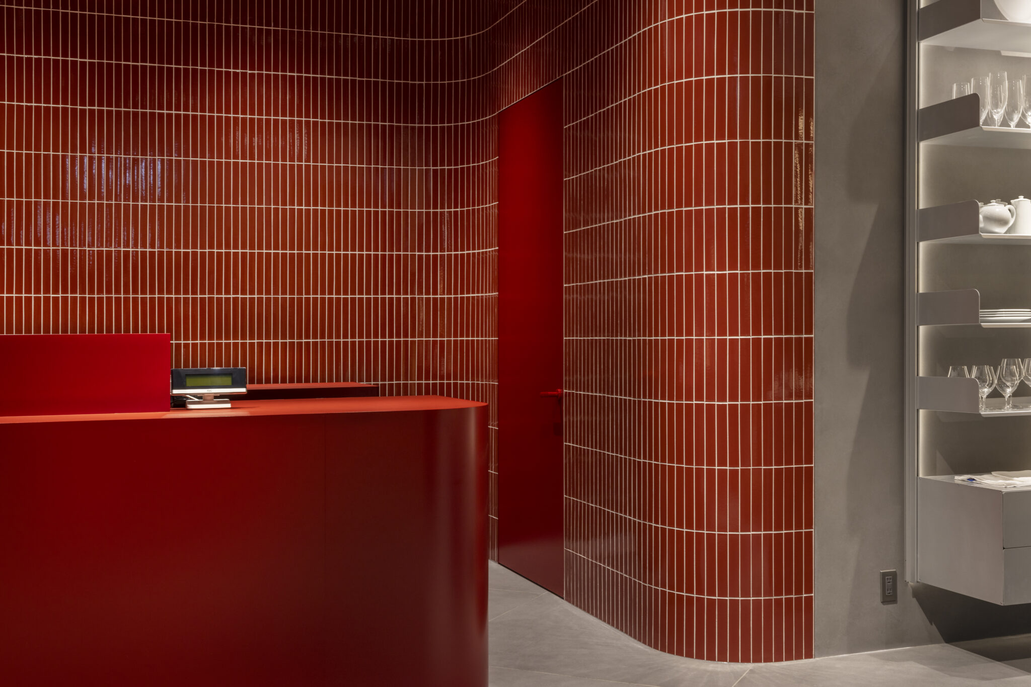
Tiles have been used in one of the shop’s two central reception spaces, which function as both checkouts and places to communicate with customers. They completely cover the walls of the space.

Tiles were really well suited to showing the distinctive curved walls of the reception space in a beautiful way.
Also, The Conran Shop Tokyo interior is composed of materials, such as plaster and wood, that encapsulate time. While tiles can be considered a standard architectural material, those with colours and forms that have been carefully made by artisans were ideal in this case, given that the shop introduces selected items that are “standard but high quality, everyday but special”.

3. When designing the tiles, what were you most particular about?

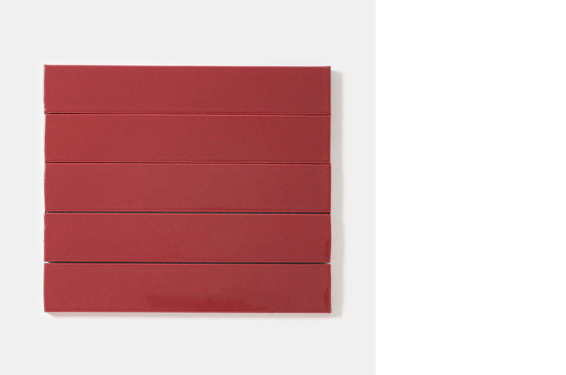
Colour, texture and even the colour of the joints.

4. What are your thoughts regarding tiles as materials? Through the production process, did you discover anything new about tiles?

Drawing out the characteristics of the tiles enhanced the appeal of the space.

5. What was it like to produce your own original tiles in Tajimi? Please share your thoughts on the benefits of this process and any other observations you made.

Tiles are a type of pottery product and through the process of kneading clay, forming a shape and firing, each tile develops its own individual variations. That’s one of their appeals. Visiting the places where tiles are manufactured revealed the artisans’ trial-and-error process and the unique value it creates, which is something that can’t be understood from the samples in catalogues and showrooms.


The Conran Shop
In 1973, Terence Conran opened The Conran Shop, a home furnishing shop in London with a selection of furniture, lighting, interior items and gifts sourced from around the world, along with numerous original items. The Conran Shop arrived in Japan in 1994 with the opening of its first shop at Shinjuku Park Tower, Tokyo. In April 2022, Shinichiro Nakahara, founder of Landscape Products, was appointed president of Conran Shop Japan Ltd.
In April 2023, The Conran Shop opened The Conran Shop Daikanyama, its first-ever locally edited shop with a focus on Asia. On November 24, 2023, The Conran Shop Tokyo opened as the brand’s seventh and largest shop in Japan.
The year 2024 marks 30 years of The Conran Shop in Japan. An exhibition, tentatively titled “Terence Conran — Designing Modern Britain”, will be held at Tokyo Station Gallery from October onwards.


edit. Nao Takegata / daily press
translate. Ben Davis

Komae-yu

year

2023

location

Tokyo, Japan

architect

Schemata Architects

method

Dry Press

volume

Quantity 555m2

photographer

photo: Ju Yeon Lee


Q&A with Jo Nagasaka

1. Please tell us a bit about Komae-yu and what kind of place it is.

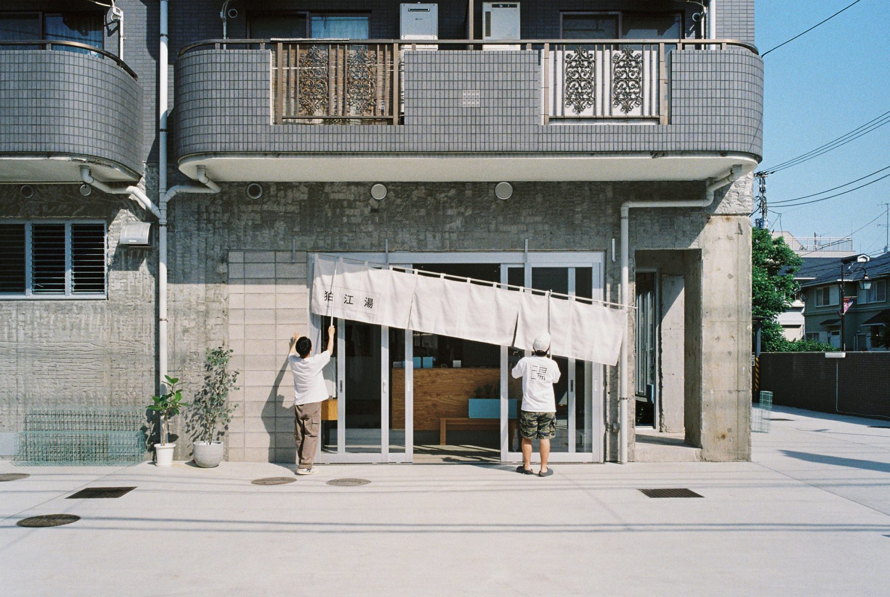
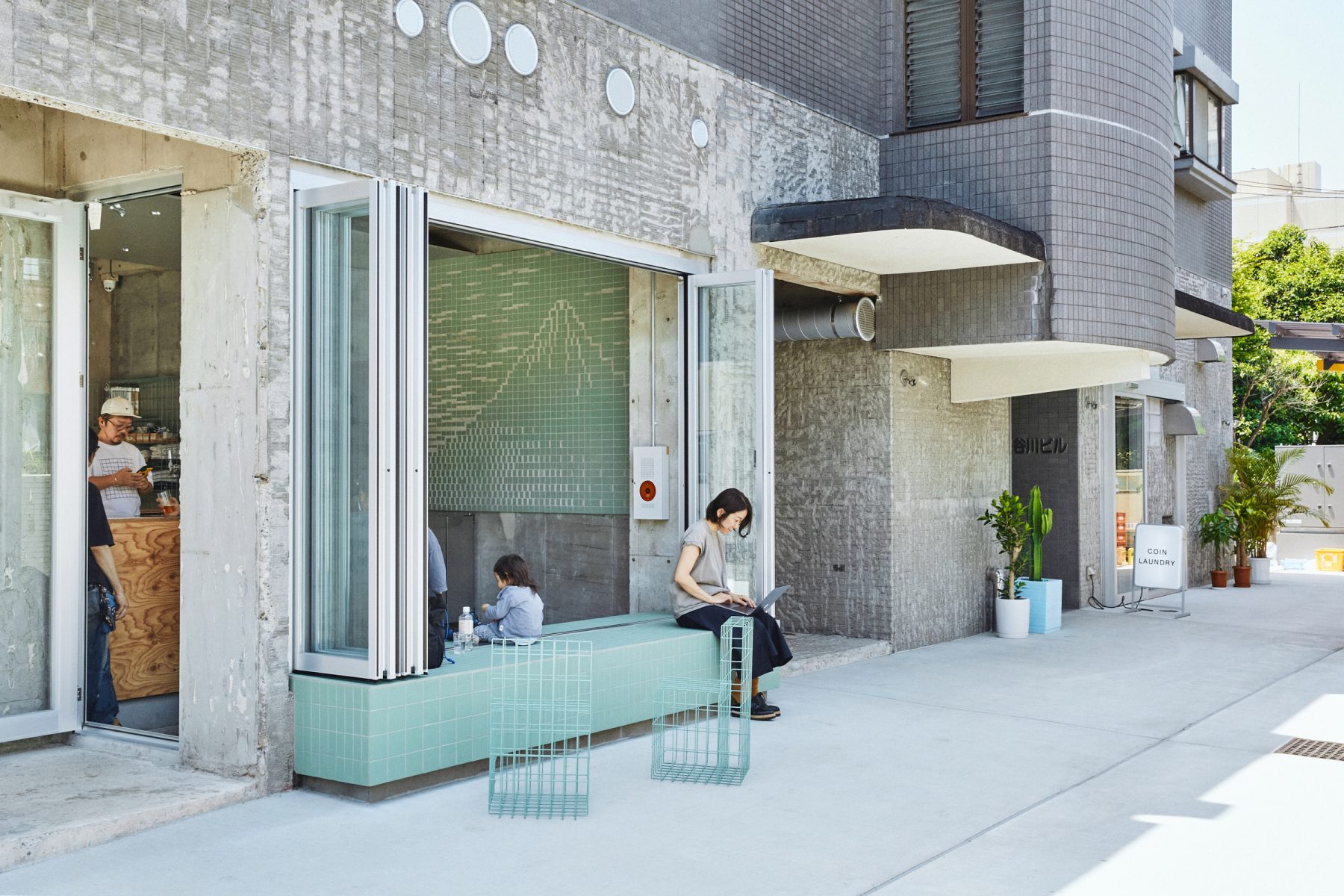
Komae-yu is a public bathhouse founded in 1955 in Komae, a place rich in nature despite its location within the Tokyo metropolitan area. Through my discussions with the owner Nishikawa-san, I thought that if bathhouses, which are no longer part of the infrastructure of daily life, are to survive in today’s world, they need to meet a wide range of needs. In addition to the bathhouse renovation, the design included the addition of a beer bar and laundry. Since its reopening, Komae-yu has hosted regular markets and events that bring together different people from different generations. I feel that it is slowly returning to its role as a bathhouse at the core of the community.

2. In which part of the space did you use tiles, and why?

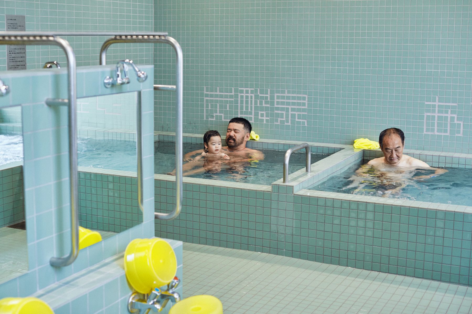
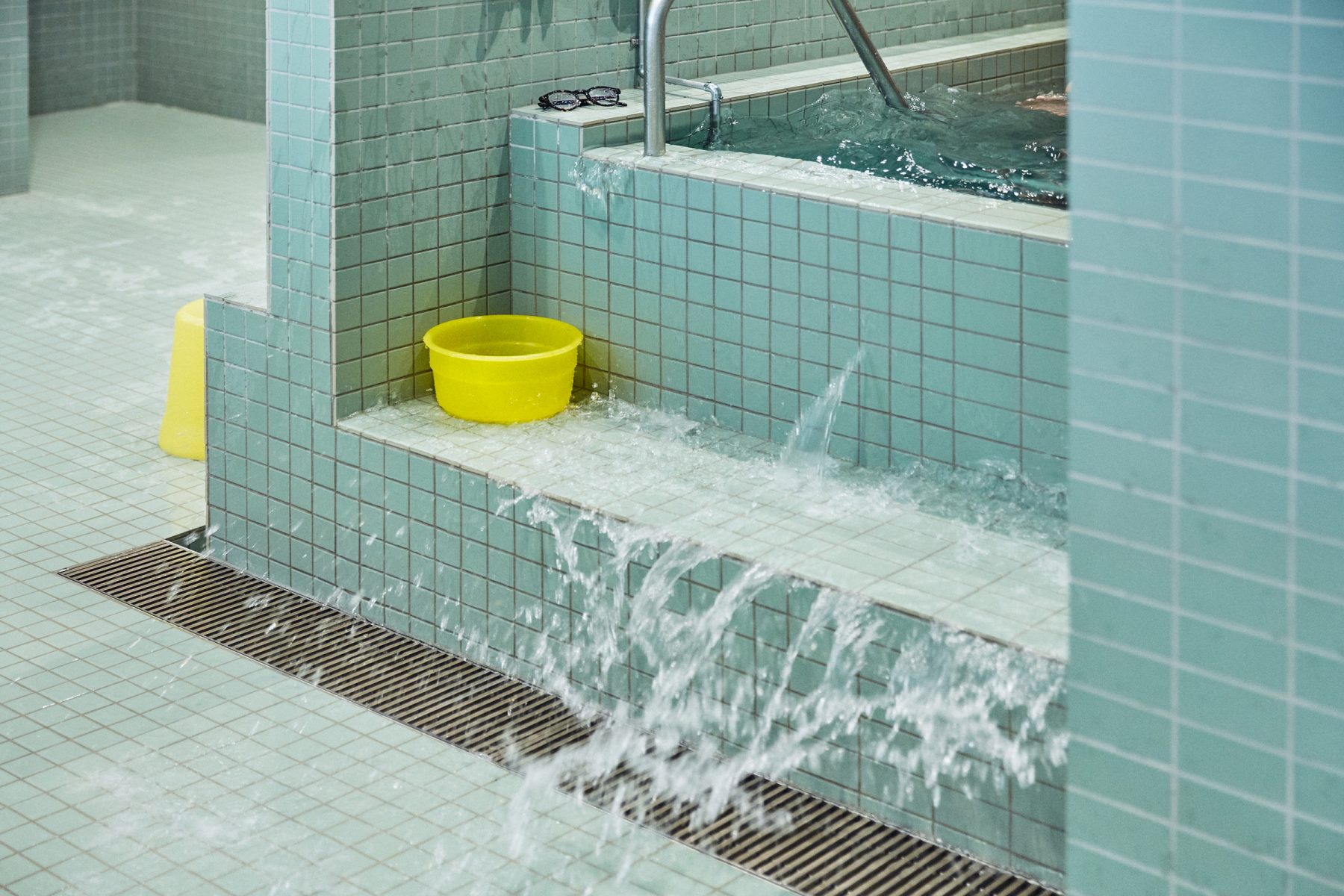
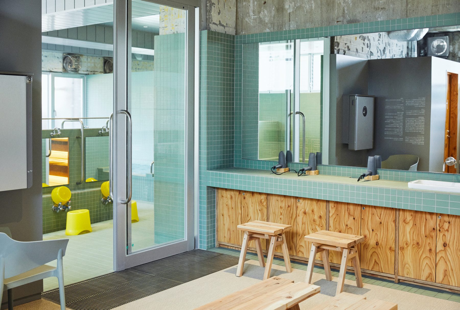
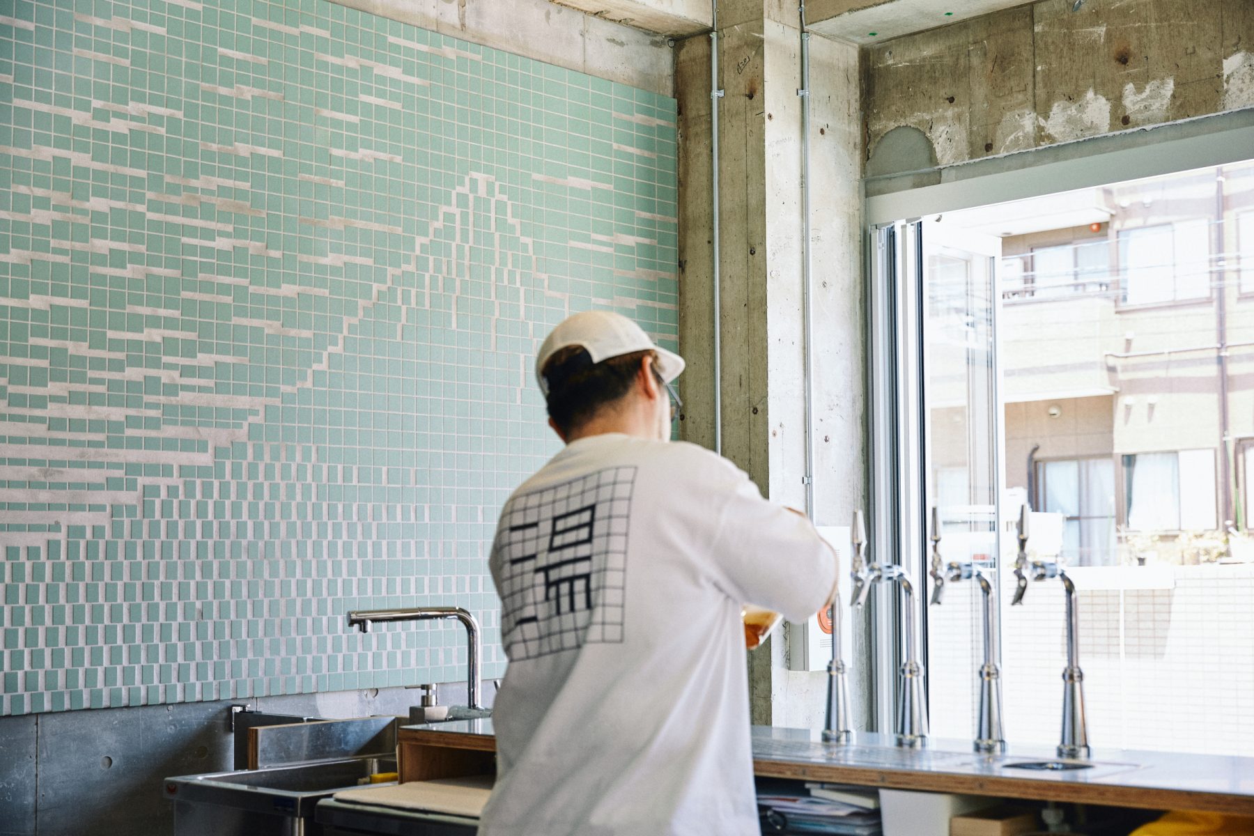
One of Nishikawa-san’s requests was that Komae-yu be open to the community, so I planned a design that would connect the inside of the bathhouse with the outside. Tiles have been used not only for the bathing area, but all kinds of places including the change room wash basins, toilets, engawa and image of Mt. Fuji at the entrance. Tiles allow you to take a flexible approach to colour and form, and through the use of mud glazes their anti-slip properties can be improved. These factors make them an ideal choice for communal places like this bathhouse.

3. When designing the tiles, what were you most particular about?

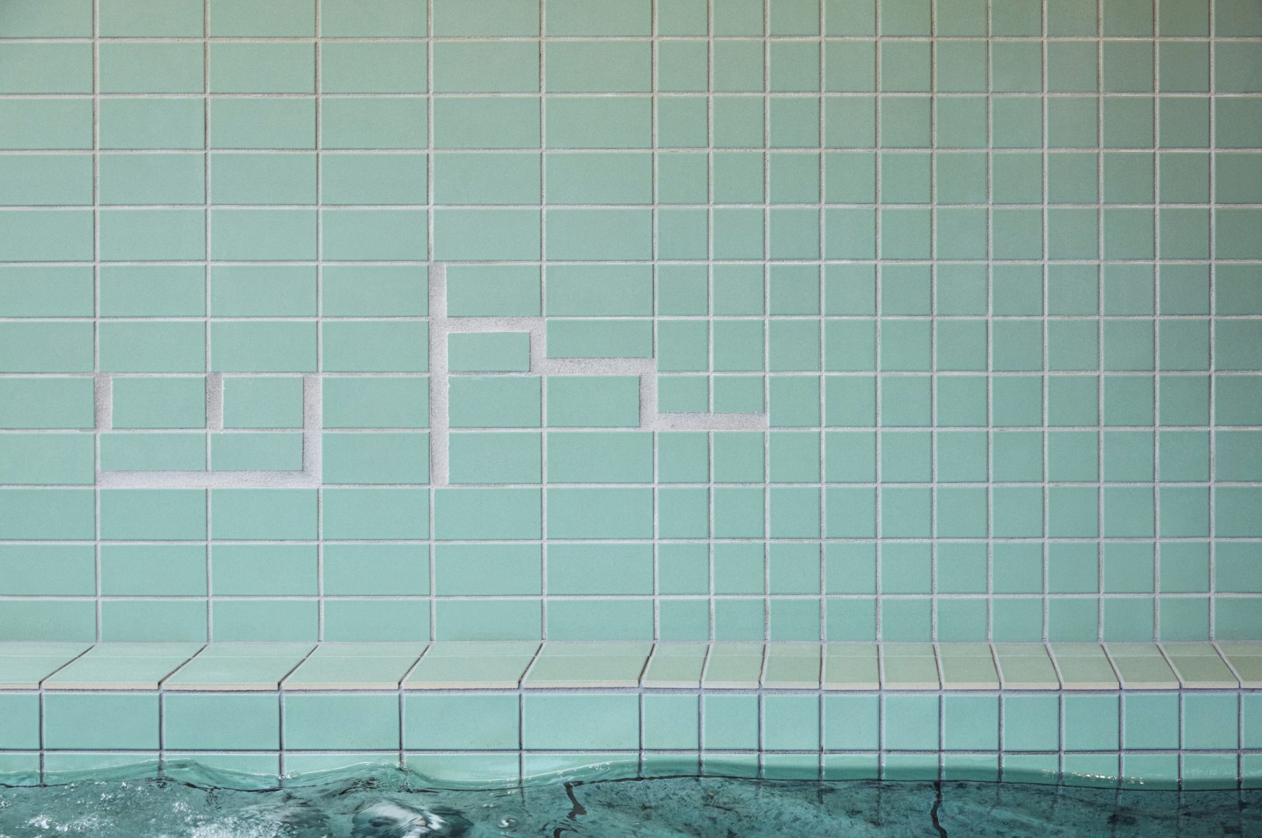
The first thing was colour. We had numerous samples made to study the tile colours that would make people’s skin, plus the water and plants, look beautiful. The second thing was the tile pattern. There are various theories, but public baths commonly feature tile patterns and images of Mt. Fuji, providing something to look at so that the naked bathers don’t feel uncomfortable in each other’s presence, while also entertaining children so that the adults can relax.
At Komae-yu we used tile units with ratios of 1:1, 1:2 and 2:2. Providing a contrast to the uneven finish of the bathing spaces, the tiles were used to create a natural pattern that would be pleasing to the eyes of bathers.

4. What was it like to produce your own original tiles in Tajimi? Please share your thoughts on the benefits of this process and any other observations you made.

These days most houses have a bath, so the focus of the design was a neighbourhood bathhouse that is no longer part of the infrastructure of daily life. At a time when upcycling has become an essential consideration, I think that Tajimi’s strength lies in its approach to production, updating existing perceptions and making tiles in a creative way.
As the world pursues increasingly efficient ways of doing things, Tajimi is rare in having maintained the production of custom tiles and I think the global demand for them is likely to grow.

5. What are your thoughts regarding tiles as materials? If you have any personal memories or thoughts about tiles, please share them with us.

Even though it’s now unfortunately closed, I can still remember my visit to Nishiki-yu bathhouse in Kyoto. Over the course of many years, tiles had been broken, fixed and replaced, and as I bathed I could see how the repairs had created a patchwork of sorts. Before I knew it, I was tracing the pattern with my eyes. It was this relaxing experience that provided the inspiration for the Komae-yu tiles.


Jo Nagasaka / Schemata Architects
Jo Nagasaka established Schemata Architects in 1998 and is currently based in
Sendagaya, Tokyo. The scale of his work ranges from furniture and architecture to
urban development, while also spanning multiple genres. Working in Japan and abroad,
his design approach is always based on a 1:1 scale and starts with the exploration of
materials. He discovers new perspectives from within existing environments, while
establishing his own vision through unique ideas such as subtraction, the update of
knowledge and invisible development. Selected works include Blue Bottle Coffee,
Kuwabara Shouten and Hay Tokyo.
schemata.jp


edit. Nao Takegata / daily press

all day place SHIBUYA

year

2022

location

Tokyo, Japan

architect

DDDA

method

Dry Press

volume

Quantity 716m2

photographer

photo: Kenta Hasegawa
Q&A with Daisuke Motogi

1. In which areas and interior spaces did you use tiles, and why did you decide to create your own original tiles?

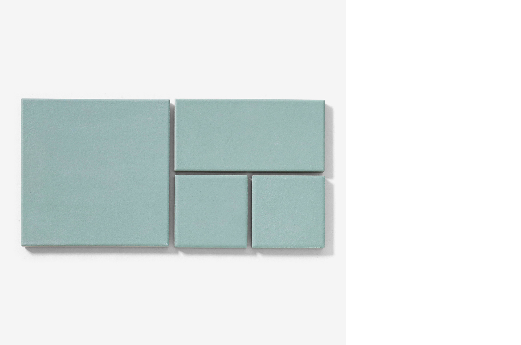
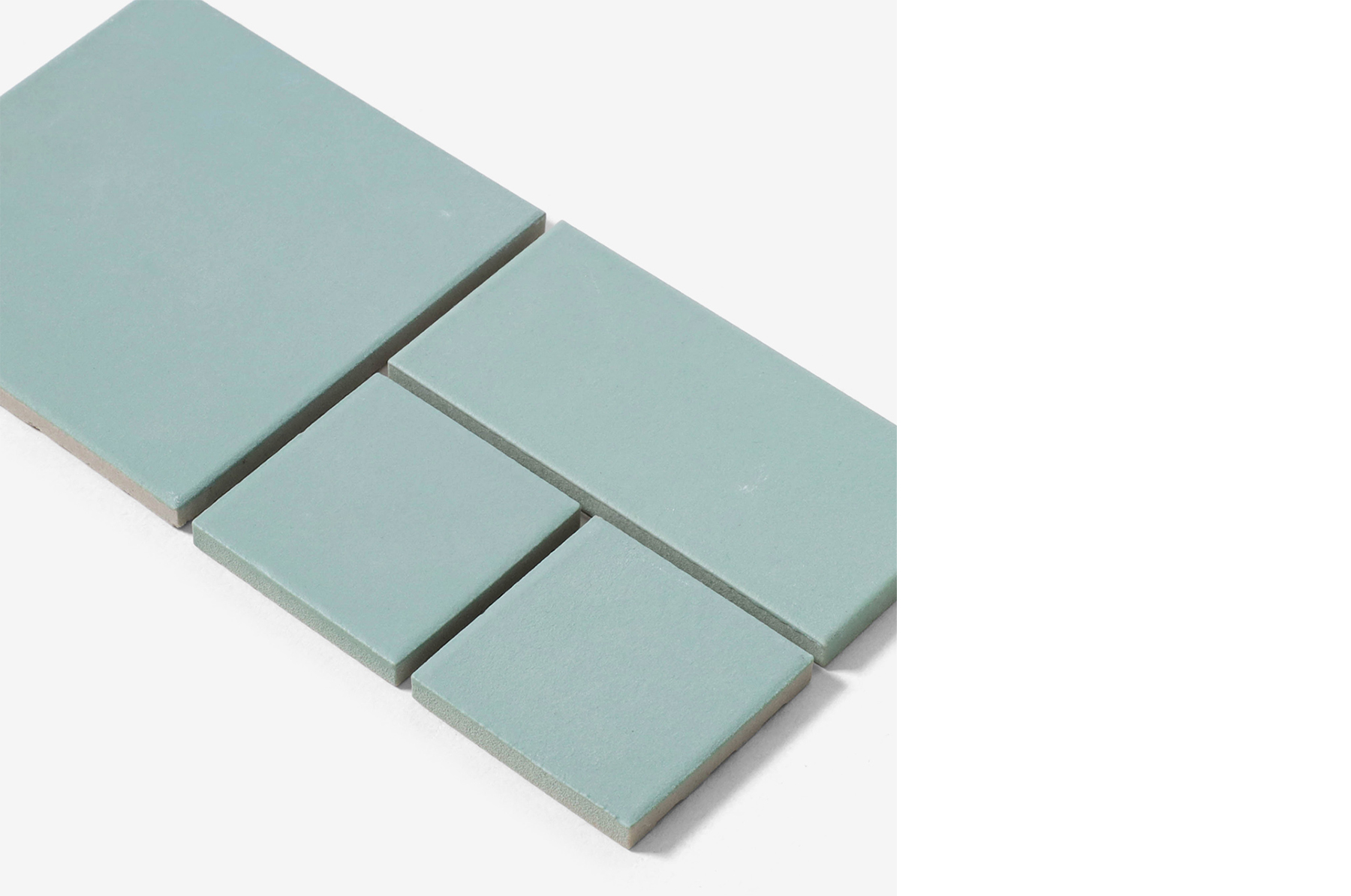
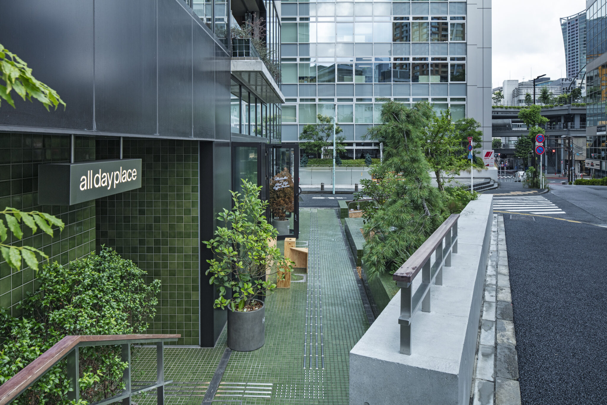
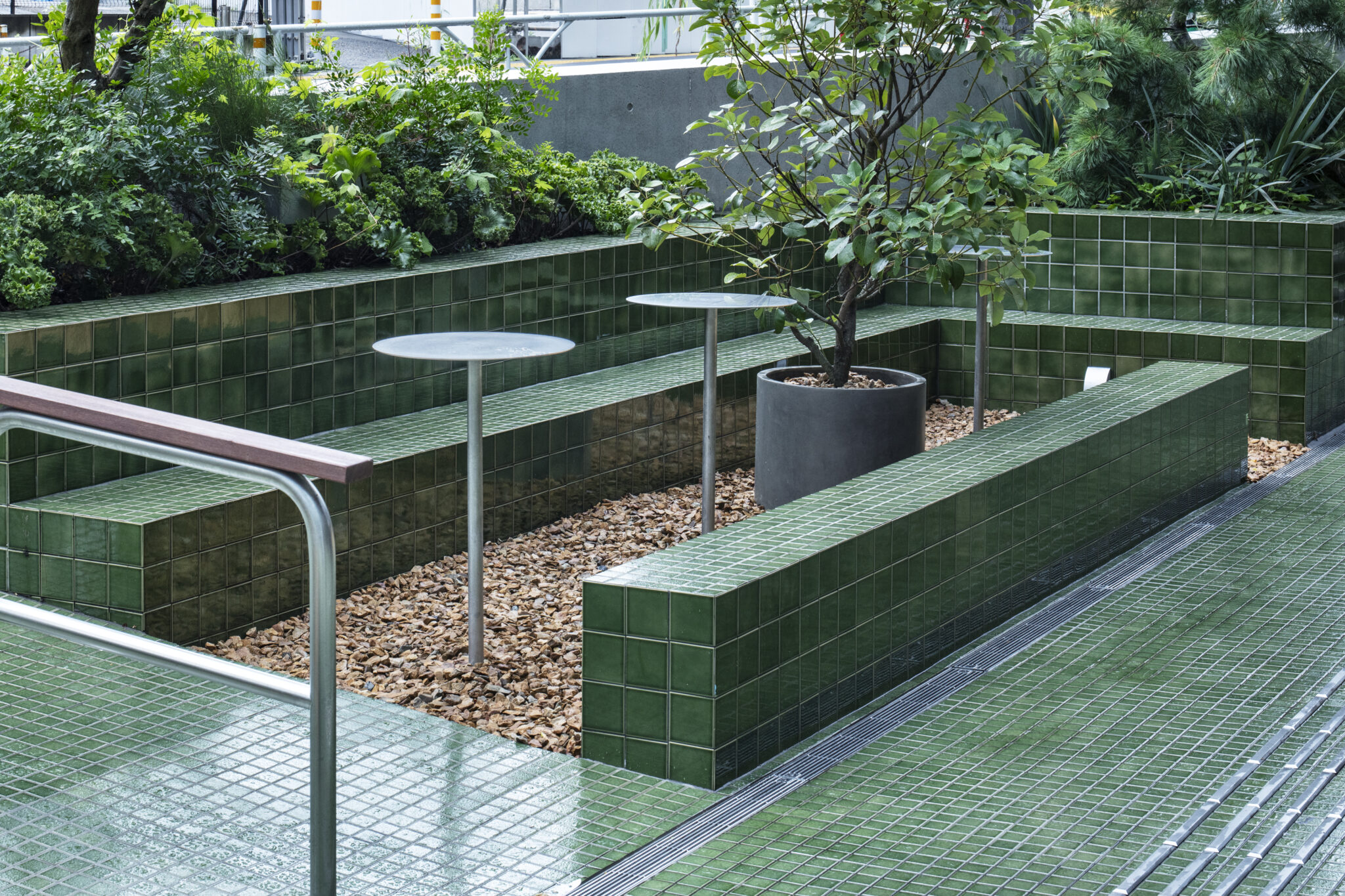
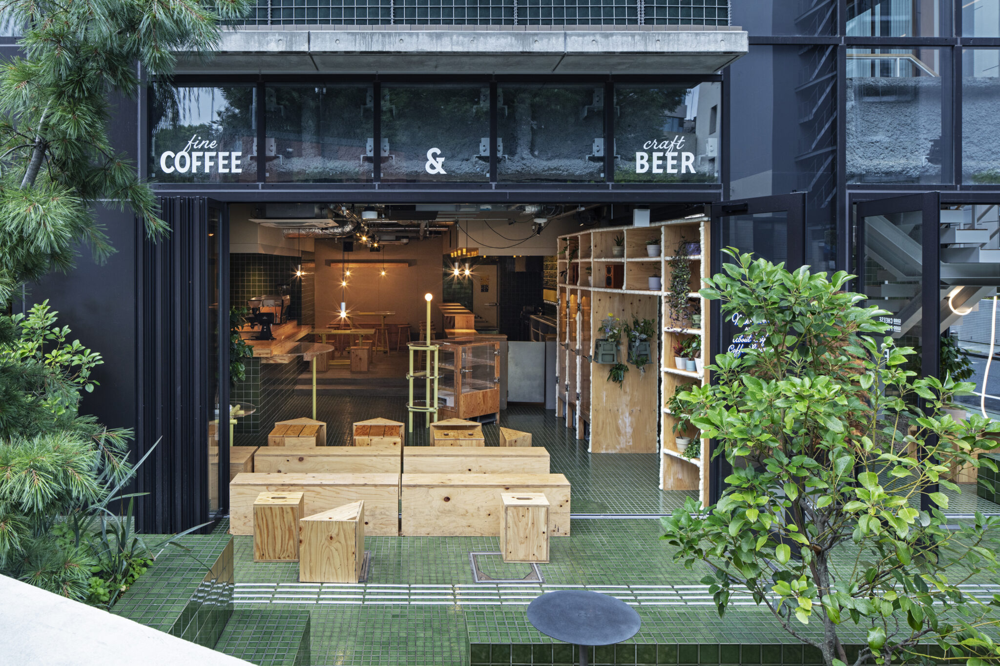
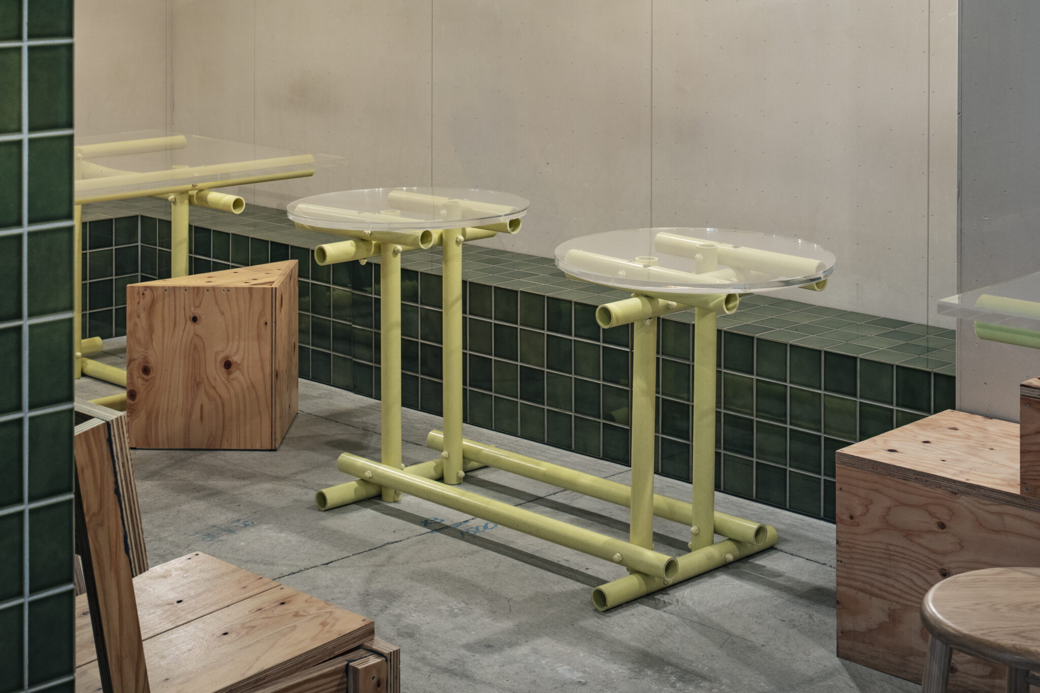
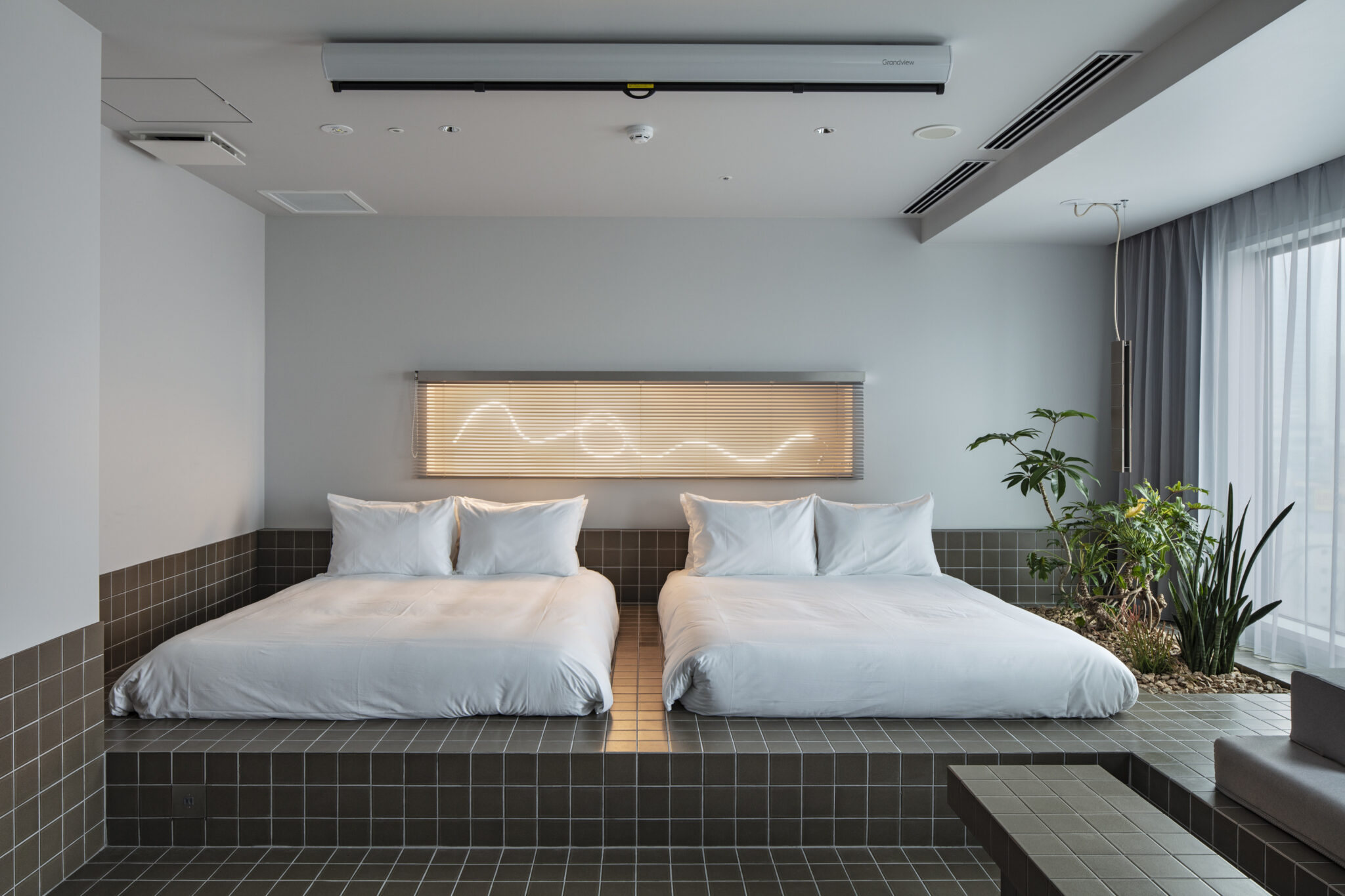
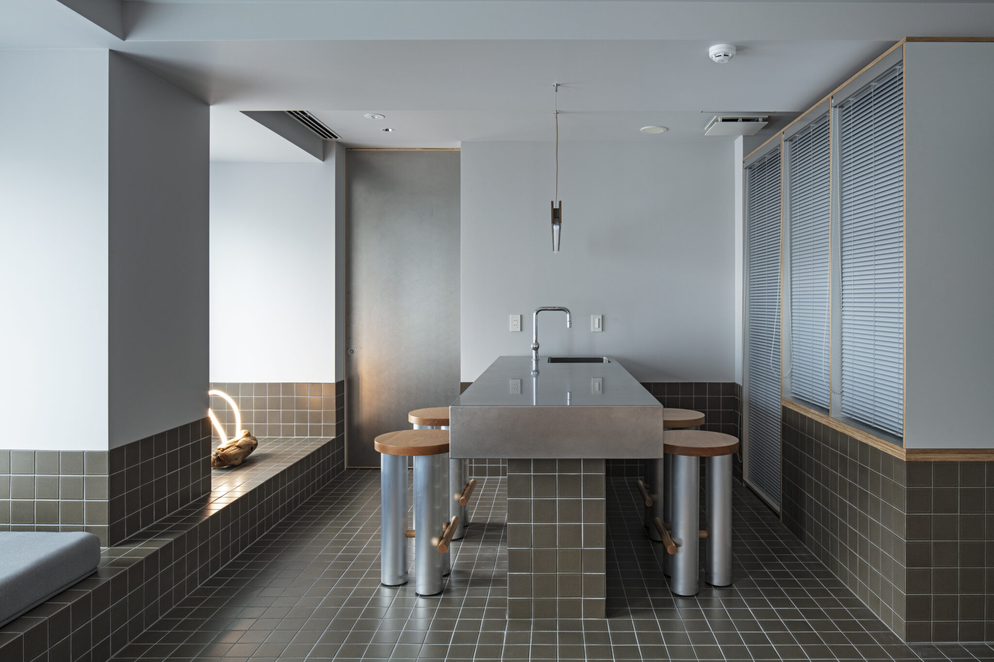
All Day Place Shibuya is based on the theme of a public house, the origin of the word “pub”. It is a place where you can get a sense of everyday life in Shibuya. The ground floor, which features a cafe and beer pub, is open from morning to night with the aim of creating a park-like space that can be used freely. I decided to use tiles in order to have the same material throughout the design, from the area outside the hotel’s ground floor entrance to the cafe and beer pub, and even the bathrooms in the suite rooms on the top floor.

2. What was the design concept behind your tiles?

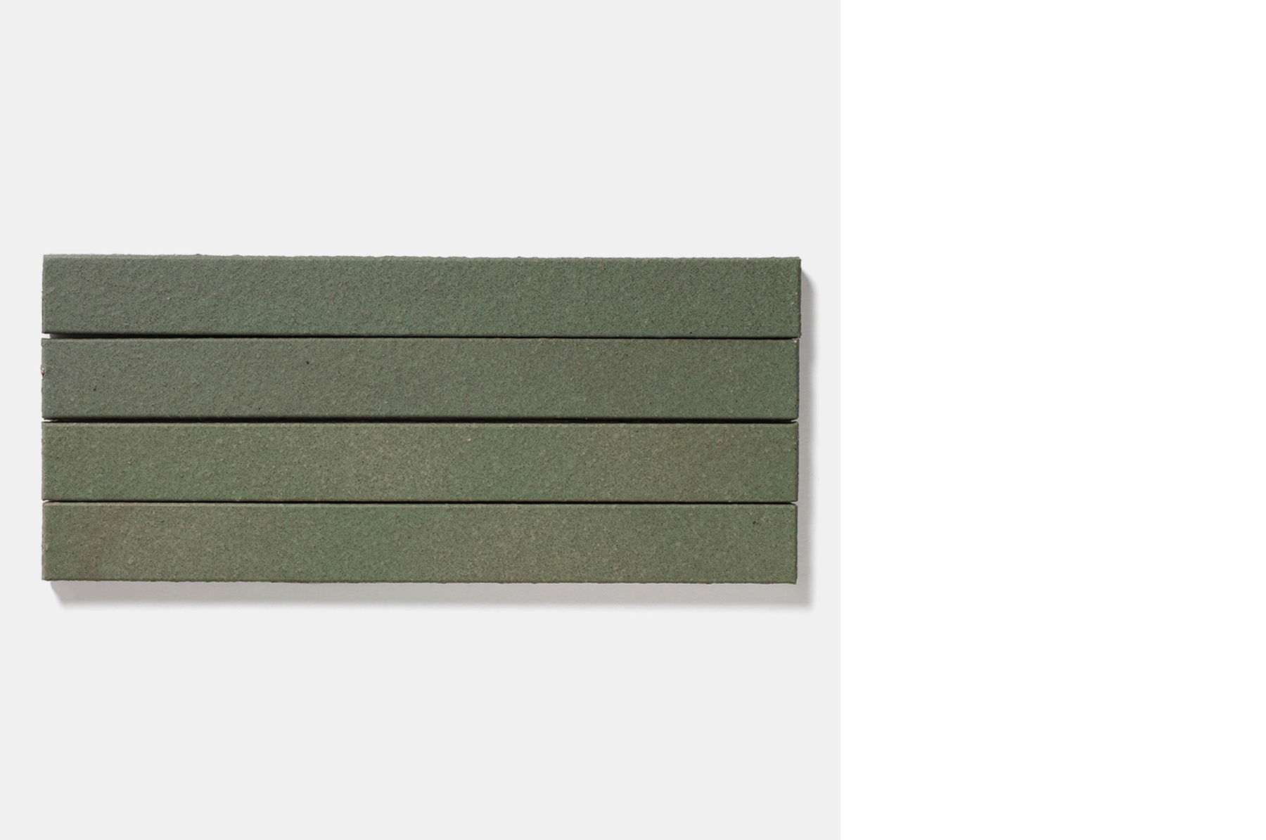
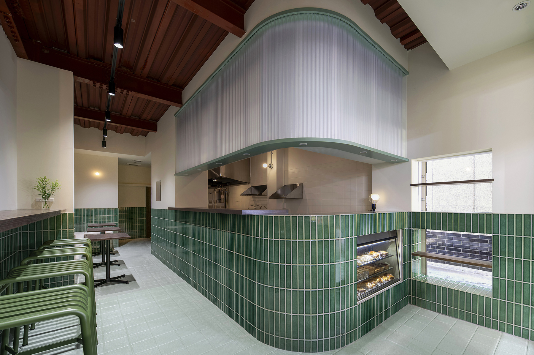
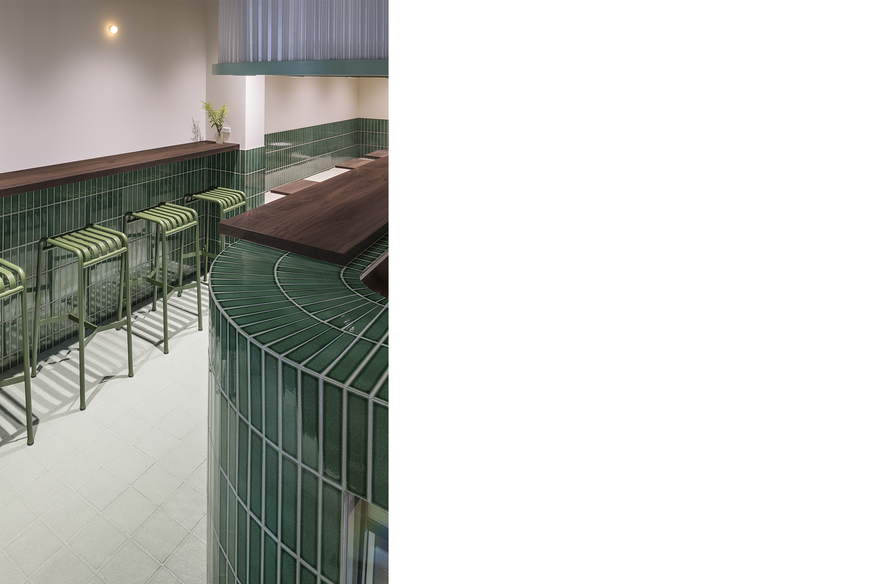
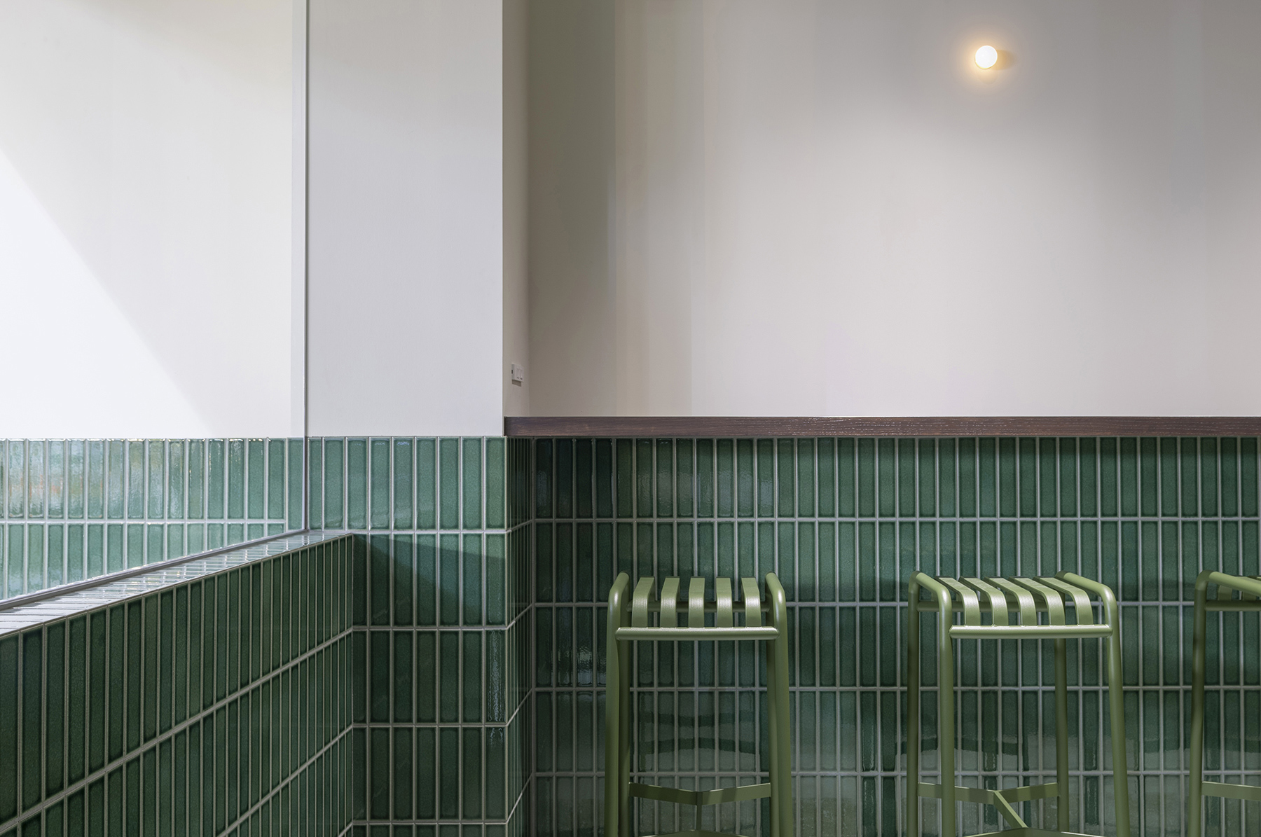
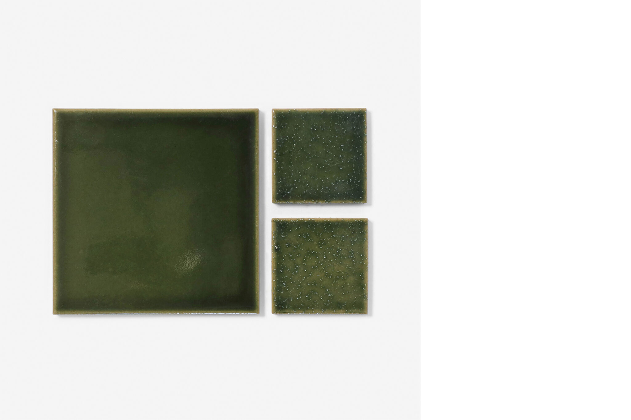
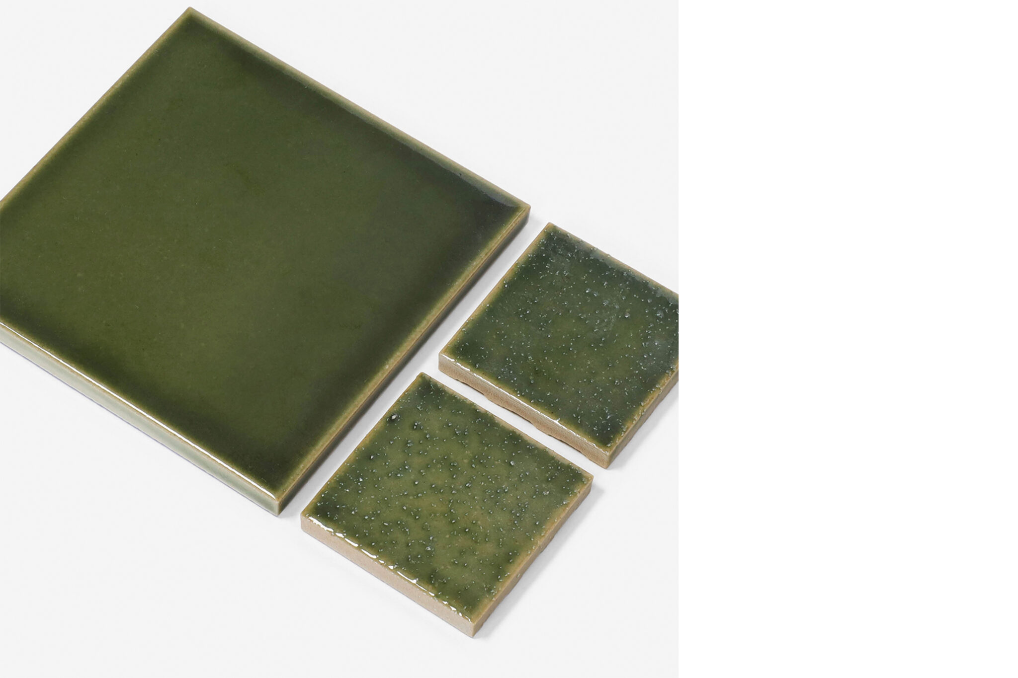
I selected green tiles to match the plants around the exterior. Mikkeller, the Danish craft beer brand based on the ground floor, asked for “a design that will look Japanese to Danish people, and Danish to Japanese people”. The green is actually a really Japanese colour. However, it has been combined with other materials so that it doesn’t appear that way.

3. What was it like to produce your own original tiles?

I was impressed by the variety and depth of the glazes.

4. Based on your experience, what are the characteristics and strengths of Tajimi as a tile producing region?

While it took some time, it was particularly good to be able to adjust the colour right from the start, and then have the manufacturers meet the anti-slip specifications for the exterior tiles.


Daisuke Motogi / DDAA
An architectural and design practice that works on multidisciplinary fields: architecture, city planning, landscape, interior, product and concept making, founded by Daisuke Motogi in 2010. In 2019, a laboratory of research and experimental design which aims to solve social challenges DDAA LAB was established. Participated in the Japan Pavilion at the 17th International Architecture Exhibition – Venice Biennale.
dskmtg.com

The North Face Sphere

year

2022

location

Tokyo, Japan

architect

Sawada Hashimura

method

Extrusion

volume

Quantity 55m2

photographer

photo: Kenta Hasegawa
Q&A with Swada Hashimura

1. Please describe the project and the concept behind the spatial design.

For this new building, which centres on The North Face’s shop, we designed everything from the architecture to the interiors. It’s a narrow site, so we aimed for architecture that feels vertically harmonious.
The shop consists of four floors — three above ground, one below — and in order to avoid it being divided floor by floor, the basement and ground floor are connected by an atrium, as are the first and second floors. The interior mood has also been composed in sets of two floors. The basement and ground floor have a reinforced concrete structure, which provides the foundation for the entire building, while the interior has been finished with tiles and plaster made from natural materials. The two upper floors have a light steel structure with an interior that centres on the use of wood.

2. In which interior spaces did you use tiles, and why did you decide to create your own original tiles?

Tiles have been used on the floor of the basement level, the lowest part of the building. The majority of the ground floor is taken up by an atrium, so upon entering the building you can look down and see the impressive tiled floor below.

3. Why did you decide to produce your own original tiles for this project?

It’s not a large area by any means and tiles were an important part of the material palette, so we wanted to create something unique to this space.

4. What was the design concept behind your tiles?

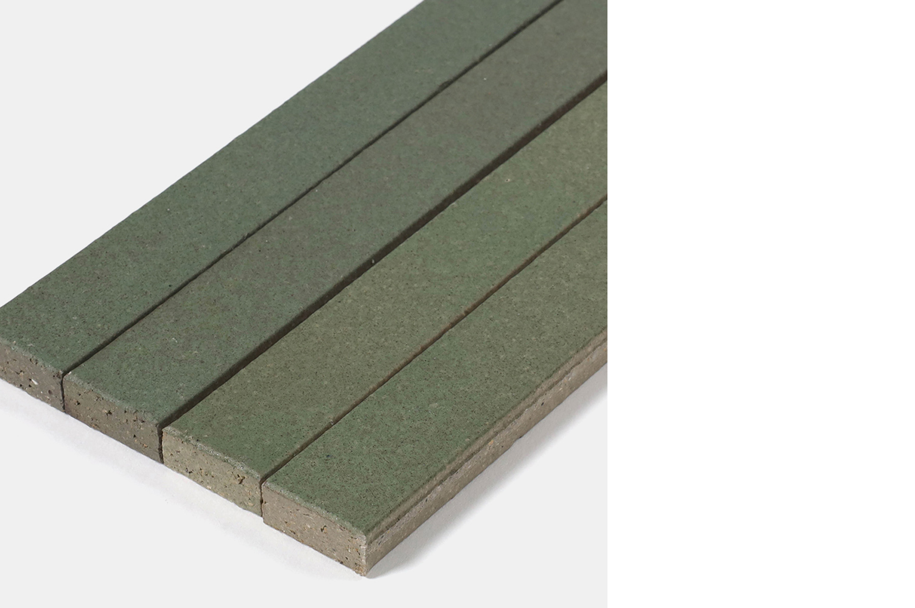
It’s the lowest part of the basement, so we aimed for fresh, glossy tiles based on the idea of “water flowing at low level”. The tiles have a white base and by adding an uneven, faintly bluish-grey colour to the small, 55mm square tile, a natural texture was born.

5. What was it like to produce your own original tiles?

We learnt about how the different manufacturing methods affect a tile’s characteristics and the makers were tenacious in helping us to achieve the tile we were aiming for.

6. What are your thoughts regarding tiles in comparison with other materials?

Tiles are a material with a different sense of time. When they are fired in the kiln, time comes to standstill. As a result, they are symbolic of things which do not change.

7. If you have any personal memories or thoughts about tiles, please share them with us.

After living in London for several years, I returned to Japan and realised that, compared to other countries, Japanese cities have so many tiled buildings. We are so accustomed to seeing them, and I’m really interested in how tiles have played a key role in shaping the cityscapes of Japan.

8. Based on your experience, what are the characteristics and strengths of Tajimi as a tile producing region?

Aside from the wealth of wisdom and experience, I think Tajimi is proactive when it comes to new initiatives, such as Tajimi Custom Tiles.


Yuichi Hashimura / Sawada Hashimura
After studying architecture at Tama Art University and University of East London (Dip.Arch), he worked at Tony Fretton Architects and Carmody Groarke in London, and New Material Research Laboratory in Tokyo. In 2015, he co-founded Sawada Hashimura with Wataru Sawada and focuses on space-related design, including architecture, interiors, and art installations.
sawadahashimura.jp

Bathroom at Salon 94

year

2022

location

New York City, USA

architect

Max Lamb

method

Pressure Moulding

volume

Quantity 34m2

photographer

photo: Clemens Kois

NUMBER SUGAR Omotesando Shop

year

2021

location

Tokyo, Japan

architect

ya Inc.

method

Extrusion

volume

Quantity 67m2

photographer

photo: Kenta Hasegawa
Q&A with Ryosuke Yamamoto

1. Please tell us a bit about this architectural project and the design concepts used in the space.

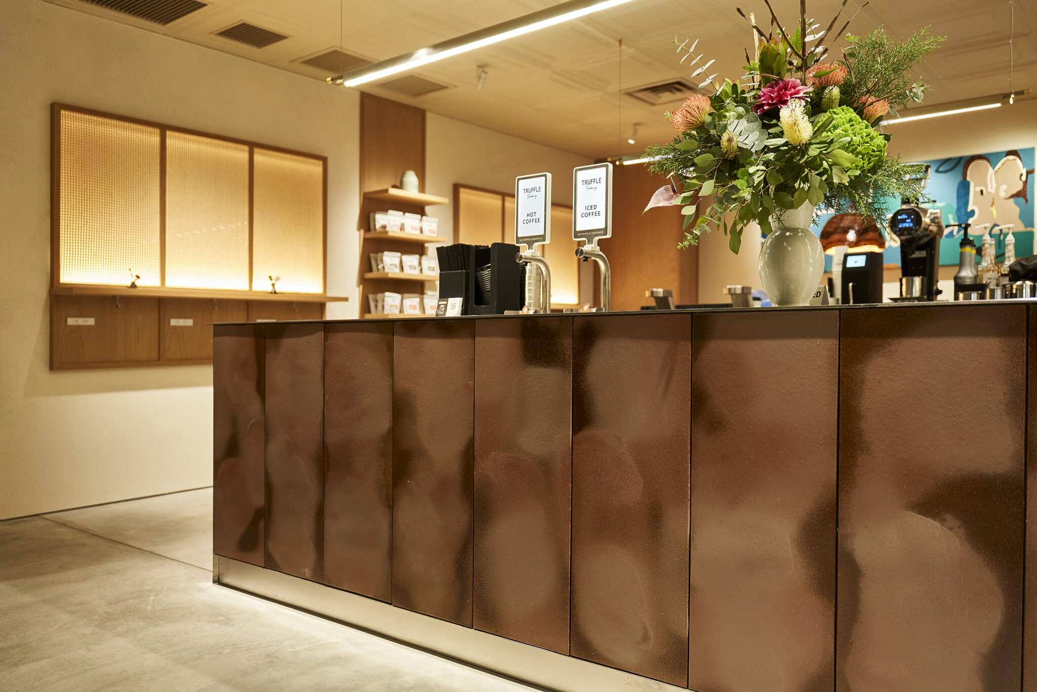
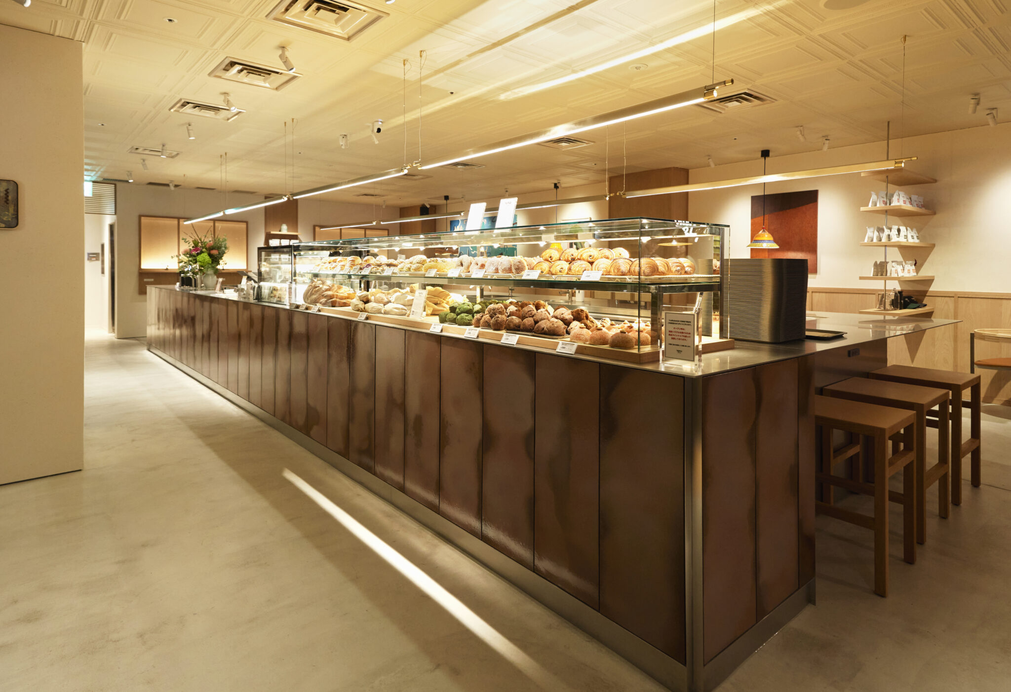
The project was a shop for Number Sugar, a manufacturer and retailer of handmade caramels. The aim was to increase customers’ expectations for the white boxes of caramels by incorporating elements of those caramels into the shop’s interior.

2. In which part of the space did you use tiles, and why?

Tiles have been used from waist level down. I thought that this would help to create a setting that enhances the appeal of the products on display.

3. Can you explain your thoughts and ideas that led to this particular tile design?

I wanted to use materials made from natural ingredients, just like the products, which led me to use tiles made from soil. Rather than creating a space using pre-existing tiles from a catalogue, I wanted to create a space that was compatible with the products and so I designed the tiles, starting with their shape, texture and colour.

4. Please tell us about the design concept for the tiles you used.

Rather than focusing on individually unique tiles, I wanted their attributes, such as uneven colours and distortions, to become apparent when they were assembled together. By arranging the tiles based on a regular perpendicular grid, I aimed to provide a feel for their distortions and varying expressions.
The tiles used for the edges were assembled and fixed prior to firing, allowing for the creation of a caramel-like mass. This connects to the hand-cut shape of the caramels, which is never perfectly rectangular.
Also, the tiles and the caramels share the same proportions.

5. What was it like to produce your own original tiles?

I visited the tile factory in Tajimi, where I was able to gain an understanding of the production process and do a variety of studies. It wasn’t only about the appearance [of the finished product], but comparing different processes from the moulding stage onwards. Discussions were held during the production, allowing me to create something that wasn’t superficial.

6. What are your thoughts regarding tiles in comparison with other materials?

I had the impression that tiles were a product with a predetermined expression based on specifications. However, I now see them as a material that can be produced in a more creative manner.

7. If you have any personal memories or thoughts about tiles, please share them with us.

Looking back through my previous work, I had never really thought about creating a design based on tiles. The reason is that I had the impression I would be using something that had already been designed, but as a result of this project, rather than starting with the tiles themselves, I now look further back and start with the soil they’re made from.

8. In your opinion, what are the characteristics and strengths of Tajimi tiles?

Tajimi has a range of factories specialising in different methods of production and it was reassuring to be able to work with various factories based on what I wanted to produce. Some of my friends, who are around my age, are based in Tajimi and I got the impression there are young creators producing new things and places.


Ryosuke Yamamoto / ya Inc.
After graduating from Tokyo University of the Arts in 2011, Yamamoto worked for Schemata Architects. He founded Ya in 2018 and works on design projects ranging from architecture to interiors, commercial spaces and furniture. Throughout the design process, he places importance on dialogue with both people and place, which is reflected in his carefully composed spaces. His recent projects include Number Sugar, Sta. and the exhibition design for “Found Muji: A Journey to Encounter Wonderful Things”.
ya-a.jp